Note: Certain details have been generalized or omitted to respect confidentiality and proprietary information.
BACKGROUND & GOAL
The goal of this study was to determine whether users understand the network plan trial for cellular devices they are signing up for, as some users had some confusion in past iterations of this experience. I also sought to assess whether there are any barriers to signing up, including assigning primary versus secondary phone numbers.

RECRUITMENT
I recruited my participants, with a sample of prospective customers including a mix of genders, incomes, races, ages, and locations nationwide. Participants are private sector employees who are involved in or responsible for purchasing business Internet and/or cellular devices for their companies.
METHOD
Qualitative usability testing with a relatively small sample size is ideal for identifying pain points and opportunity areas to refine design and messaging. Research shows that only five participants surface roughly 85% of usability issues. My seven participants exceeded that threshold.
I interviewed participants remotely, guiding them through various tasks within a prototype of the trial sign-up flow. I assessed the usability throughout, asking them questions from the moderation guide I wrote. I also probed for further insights as necessary. After synthesizing my notes from each session, I noticed several patterns that stood out.
KEY TAKEAWAYS
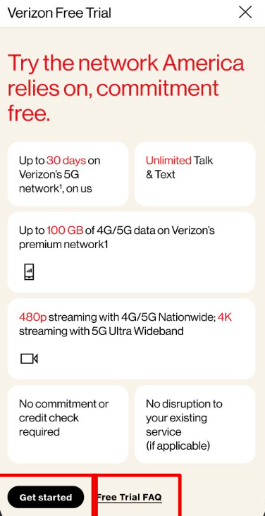
• Users understand the terms of the trial, including that it is commitment free for 30 days.
• However, some need further clarity that this is for mobile service, as opposed to standard business Internet.
• Most users find this to be an enticing offer that they would utilize given the opportunity.
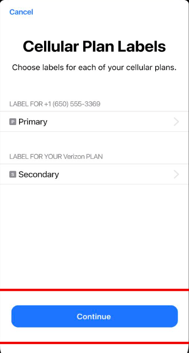
• Users somewhat understand the concept of primary versus secondary numbers.
• They know that primary is their current carrier, and secondary is their temporary Verizon number.
• However, they are uncertain if they are making the correct choices for each device function (eg, cellular data) for the trial.
• Participants find this to be a smooth experience overall.
• They are able to navigate through the steps easily, and encounter few to no mechanical usability issues (such as CTAs that are hard to notice).
• Most find the content mostly clear throughout the flow, and have enough information to guide them.
DETAILED FINDINGS
01: Users generally understand what the trial entails
Most users understand what they’re signing up for, in terms of service, from a high level. However, the mobile aspect could be emphasized more clearly, particularly on the tiled page outlining the trial.
Some are initially surprised that this is a mobile service, when they expected more traditional business Internet (previous research has shown some SMBs use personal lines for business, and don’t expect phones to be a ‘’business grade’’ service, so in this context they expected Internet). All understand the terms of the trial, including that their current service/phone number won't be interrupted.
02: Users find this offer to be compelling
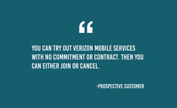
Participants are intrigued by this 30 day trial, primarily because it’s risk free. Most point out being happy with the fact that their current service won’t be disrupted.
Most users appreciate that they don't have to give their credit card information and potentially get charged if they forget to cancel. Some are drawn in by the unlimited talk/text feature, and some mention being happy that the trial is free.
Some users, however, are less enticed by what they consider to be low speeds for their business needs, and would want a faster plan to proceed.
03: Usability throughout the flow is smooth
All participants overall find this experience to be intuitive, with clear steps to complete each task. Users seemed most immediately interested in the terms of the trial. We suggest moving the bottom two tiles to the top, and have the technical details follow. After entering their zip code, one user is confused by the lack of a confirmation that this service would be available based on their location.
All users know that if they want to become a full-time customer that they can click Join now at the end of this flow. Most users clicked the FAQs link, unprompted, before clicking Get started.
04: Users only somewhat understand primary versus secondary numbers
Most understand that primary is referring to the phone number with their current carrier, and secondary is the temporary number Verizon assigns to them for the trial period. Most are initially surprised that they can have two numbers on the same phone. Most would switch between the two to see how it works; and some would click the secondary line to try the Verizon service right away for the default line.
Most, however, want a clearer description of what primary versus their secondary number entails and how it works, so they know which option to choose for each of the functions.
05: Users speculate on what happens when the trial ends
All users understand that they have the option to become a customer if they want. Most expect to get some kind of notification before the trial ends letting them know that they have the option to cancel or sign up for Verizon.
Most think that the trial will just disappear if they don't decide to become a customer. Many point out that they didn't have to enter their credit card information in the flow, so there's no risk of getting charged if they don't take action.
RECOMMENDATIONS
Use clearer language to make it immediately apparent to users that this trial pertains to cellular service, and not standard business Internet.
Incorporate descriptions and/or examples of what each phone number (primary and secondary) is ideal for to guide users to make the best selections.
Inform users on what will happen once their trial ends to give them a clear idea of steps, and eliminate any confusion.
Because users are most immediately drawn to the terms of the trial, the “learn more” landing page should better reflect this. Move the tiles describing the terms of the trial to the top of the page, followed by the technical details.
IMPACT
Pinpointed areas of improvement for stakeholders, including designers, to iterate on designs to positively impact users and ultimately increase revenue.