Roles
UX/UI designer | Researcher
Duration
Five weeks
Tools
Sketch | Invision | Zoom
01 Overview
For this Flatiron School project, I created an app called Locus that accompanies the (fictional) boutique yoga studio by the same name. Through this app, users can digitally connect to a welcoming, restorative community, where they are able to escape everyday life and enjoy an experience that’s tailored to them in an inclusive, non-judgmental atmosphere.
02 the challenge
The project brief entailed coming up with key characteristics of a gym or similar workout platform, and representing those characteristics through an app. The workout platform should be unique and fill a void in the current market.
According to my research, I found that the workout market is saturated with generic gyms, so I decided to come up with a yoga studio concept instead. It would have a more luxurious feel, with spa-like amenities to separate it from other yoga studios. Now I had to create an app to visually tie in to the physical space, and engage its members in a virtual setting while creating brand loyalty.
03 Competitive Analysis
I began my process by conducting a competitive analysis to put my project into context and understand the inner workings of the competitors’ (both direct and indirect) apps. By analyzing the apps of five health and fitness brands, I was able to find out what works and what doesn’t. After seeing what was actually successful however, I decided to incorporate the following insights into my final design:
•strike a balance between having enough features to be engaging without overwhelming the user
•clean, minimal designs with occasional color accents are visually appealing
•photography should be unique and eye-catching, as the market is saturated with predictable stock photography
•an awards programs is likely to draw users in
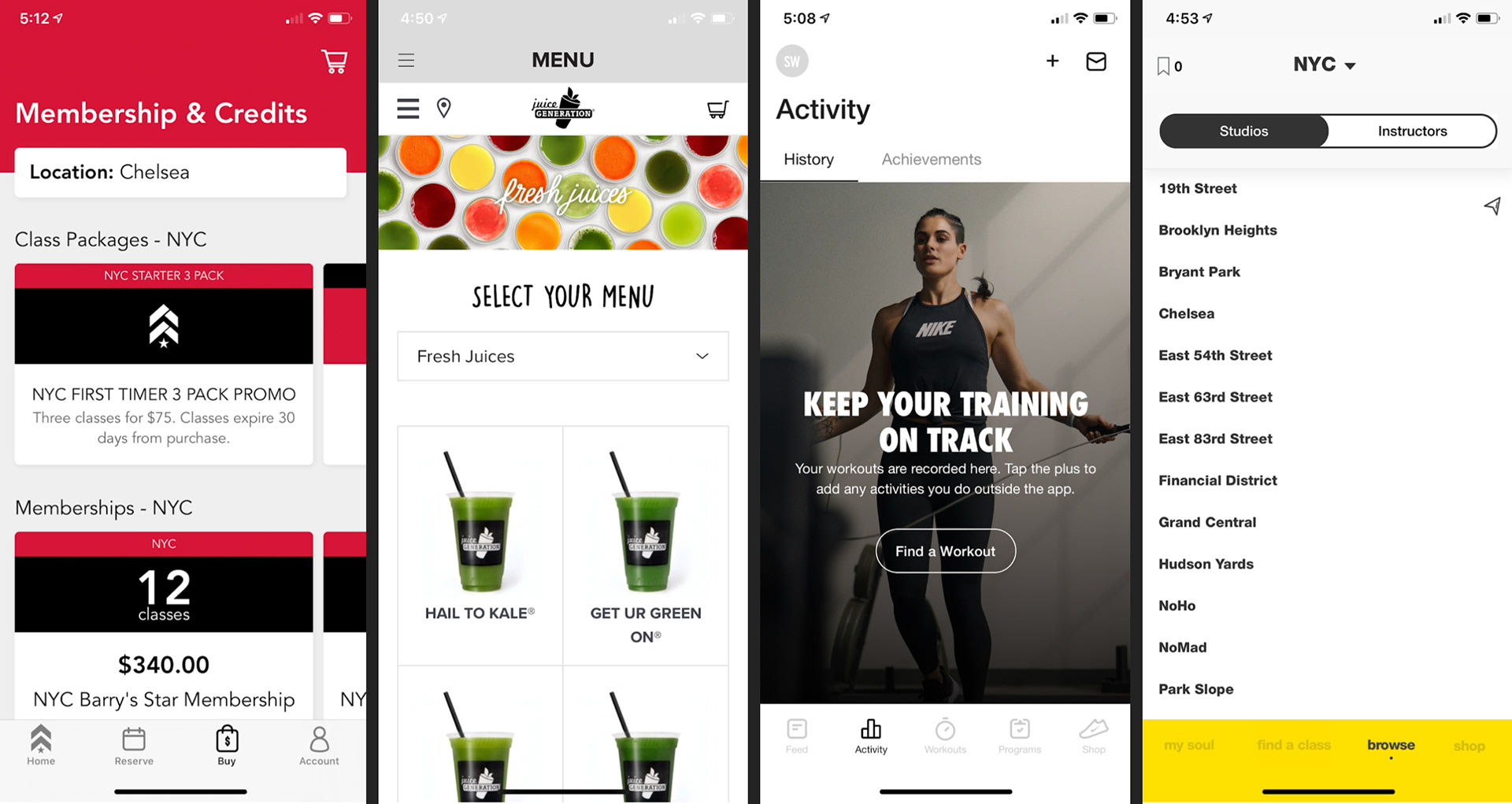
Screenshots from Barry's Boot Camp, Juice Generation, Nike Training, and SoulCycle
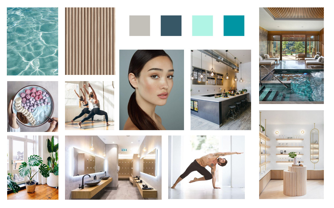
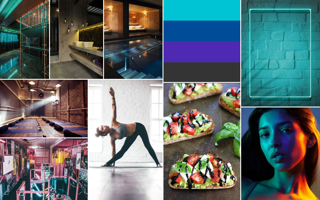
04 Mood Boards
I created two divergent mood boards to establish a visual direction before committing to specific design elements. The first encapsulated a serene, zen-like spa experience with natural textures like wood, greenery from plants, and a muted color palette. Based on feedback I received, this mood board is visually appealing but generic and overdone. So I decided to go with option two.
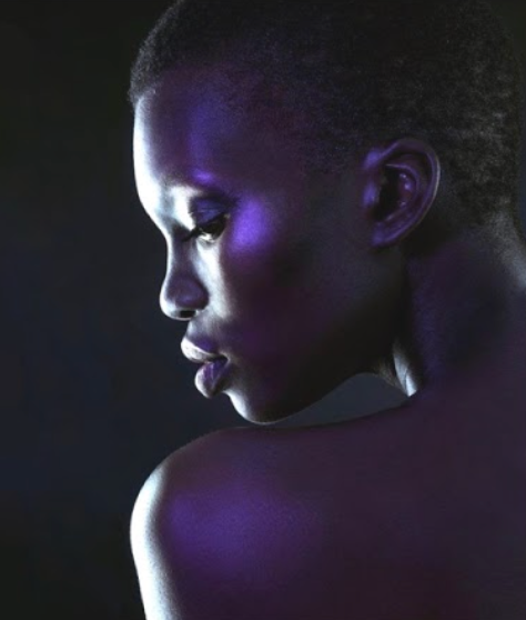
This mood board encompasses the industrial aesthetic of Locus with its neon lights and colorful accents. It capture members’ experience in an edgy but approachable environment, which is later reflected in the app.
04 Style Tiles
I created two divergent style tiles as a further iteration on the mood boards to include specific style elements such as typography, iconography, logos, and a color palette. The second one better reflects the brand components of Locus, and was the basis for the final designs.
The purple would be used as a visual anchor throughout the app, the darker blue for call-to-action buttons and some text, and the teal as an accent color.
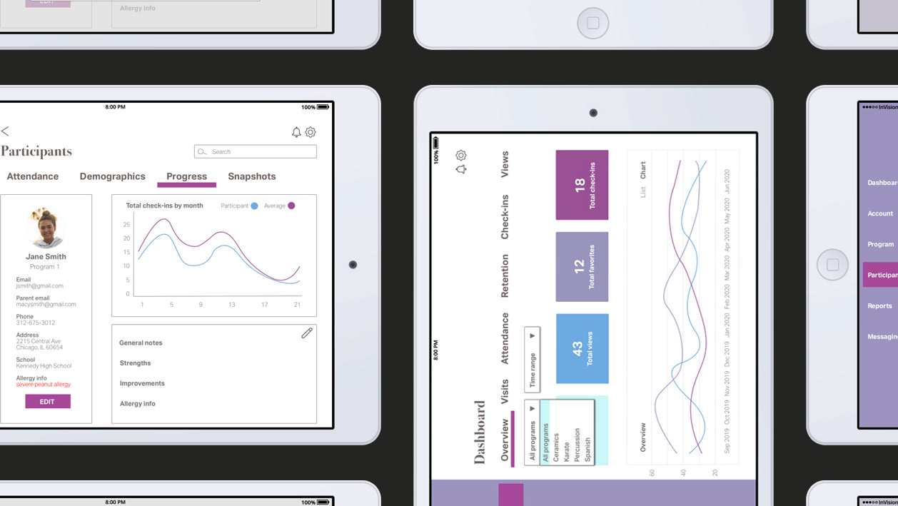
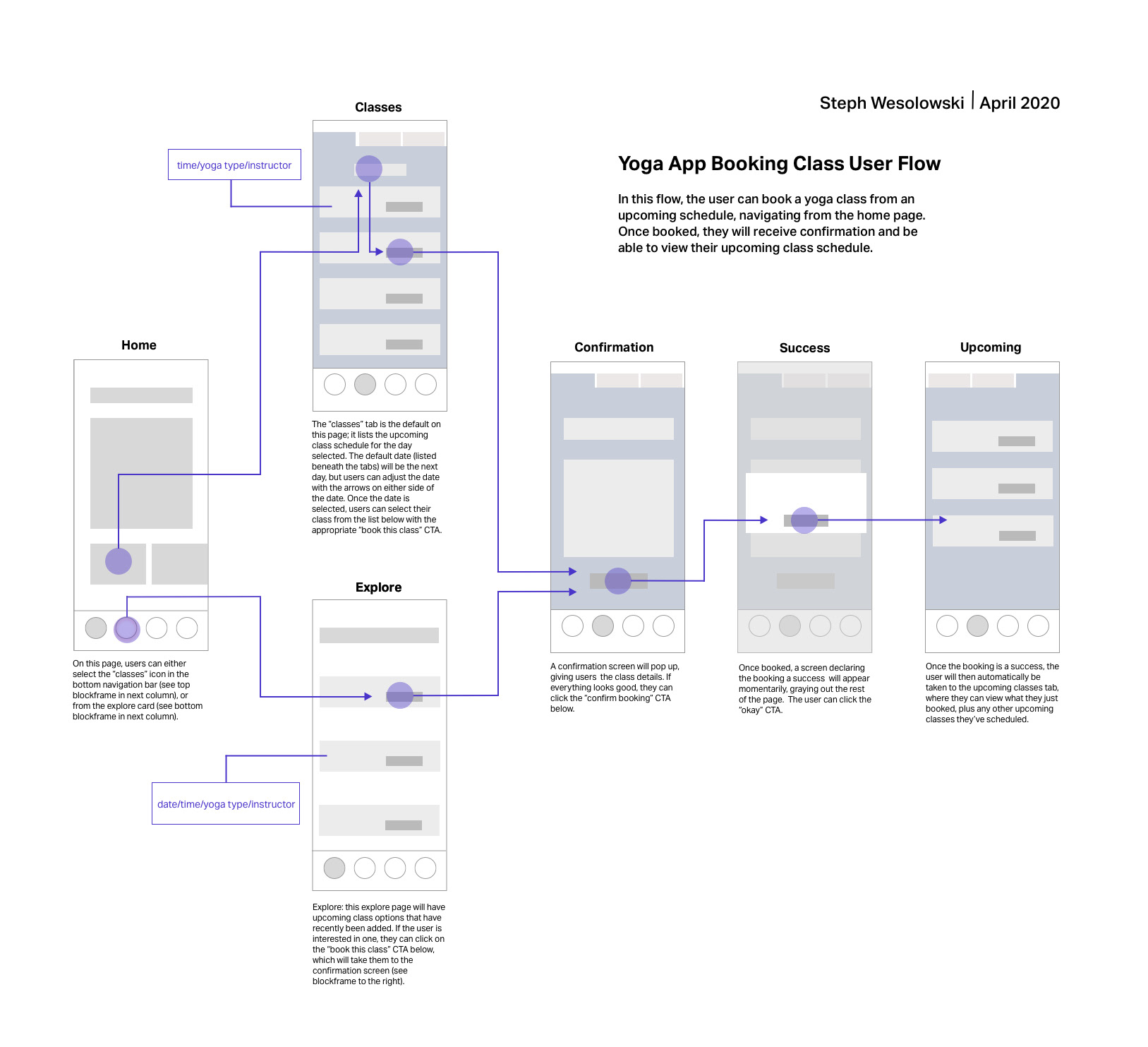
06 Wireframes
Once an aesthetic was established, I created a user flow diagram to show how the user would navigate through the final design. I chose an essential task in my app, booking a class, and created a step-by-step journey of completing this task through wireframes.
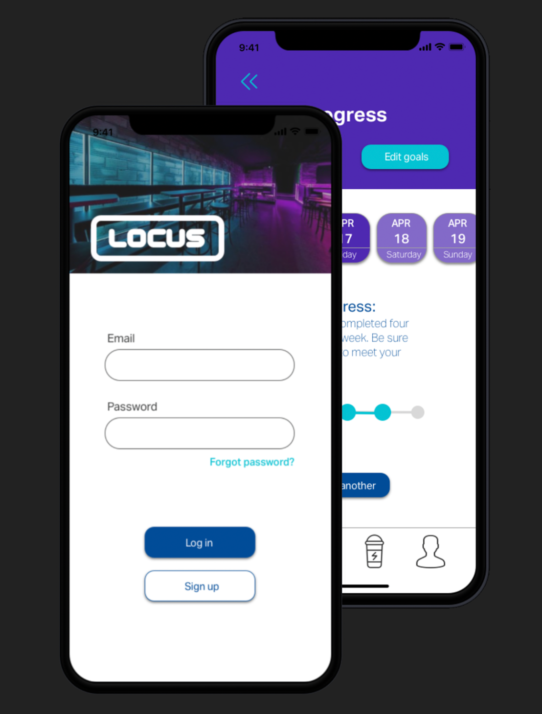
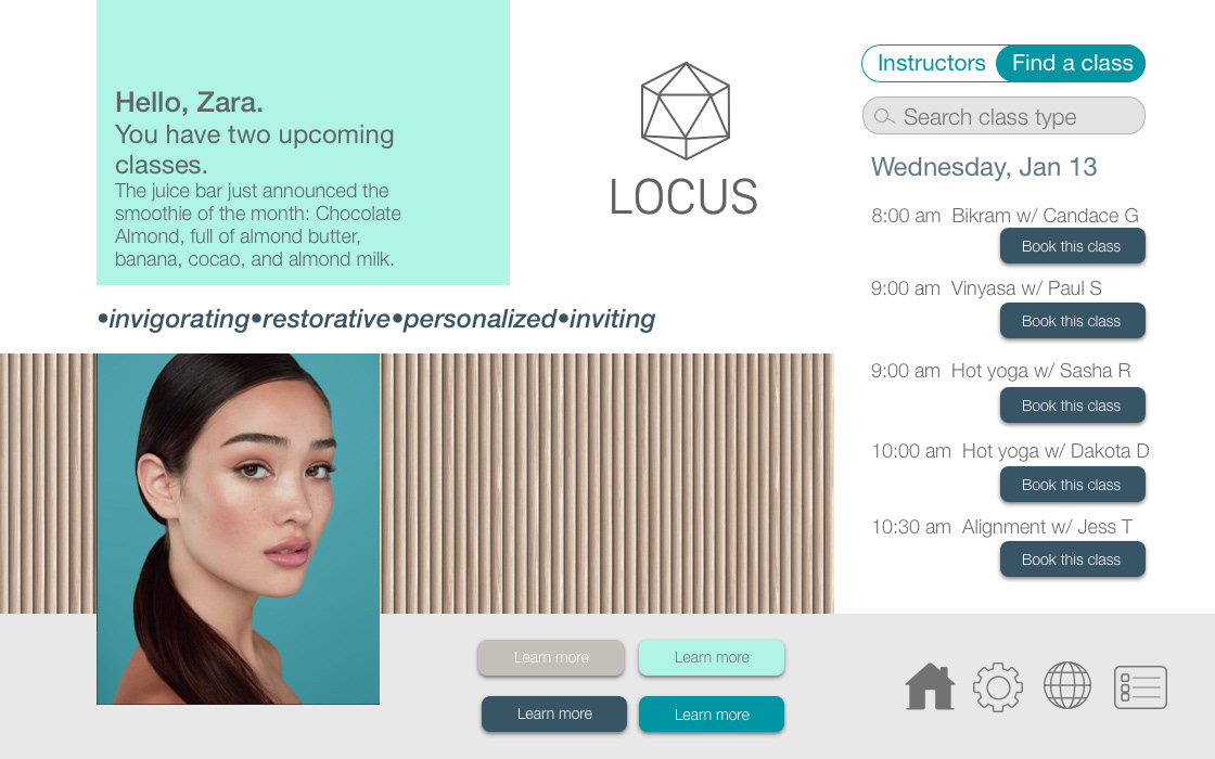
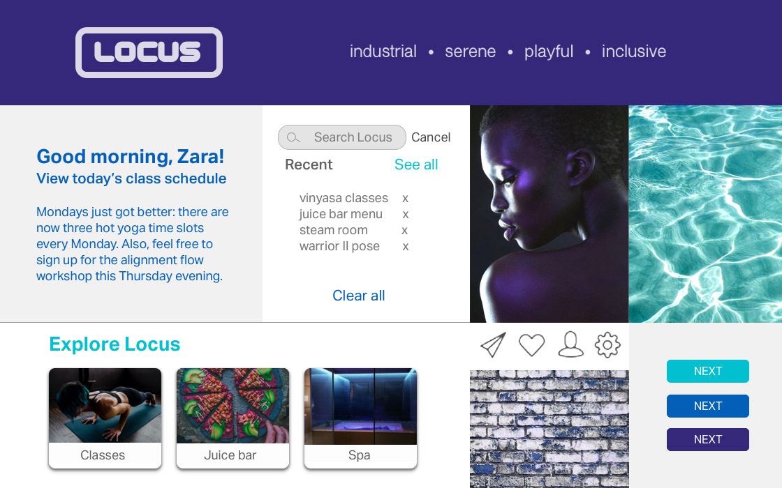
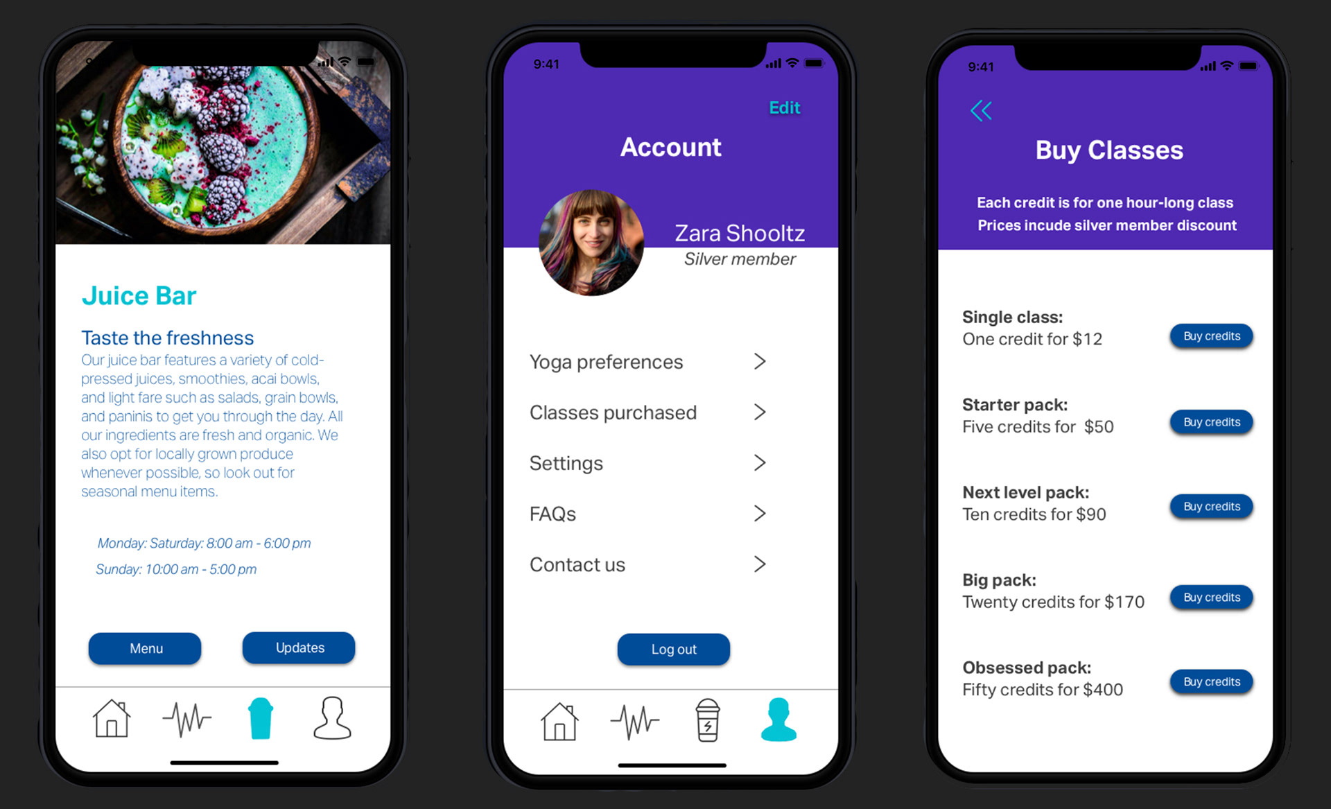
07 High Fidelity Screens
The next stage of the design process was creating high fidelity screens in the aesthetic of the chosen style tile. My goal throughout this process was to incorporate features that would keep the users engaged, and give them options to customize their experience.
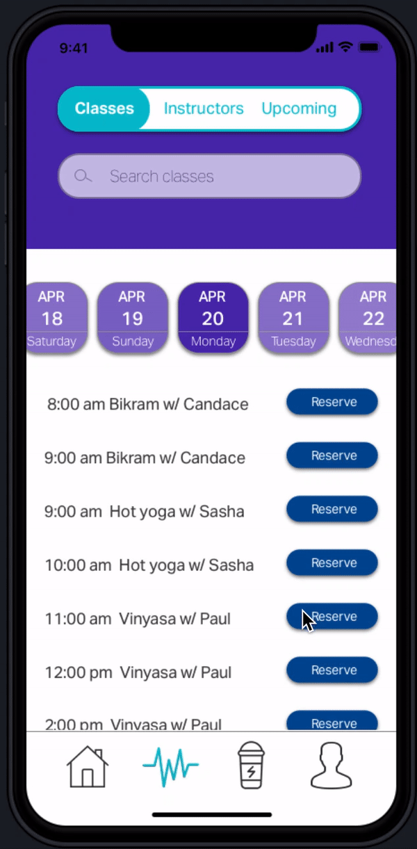
One of the first things to tackle was fleshing out the task of booking a class established in the above user flow wireframes. I created a slide that included a calendar of upcoming classes, instructor list with their photos, and a schedule of upcoming reserved classes. I also included an onboarding process for new members to sign up (here they would provide basic information and select their favorite yoga styles from a list) and current members to sign in.
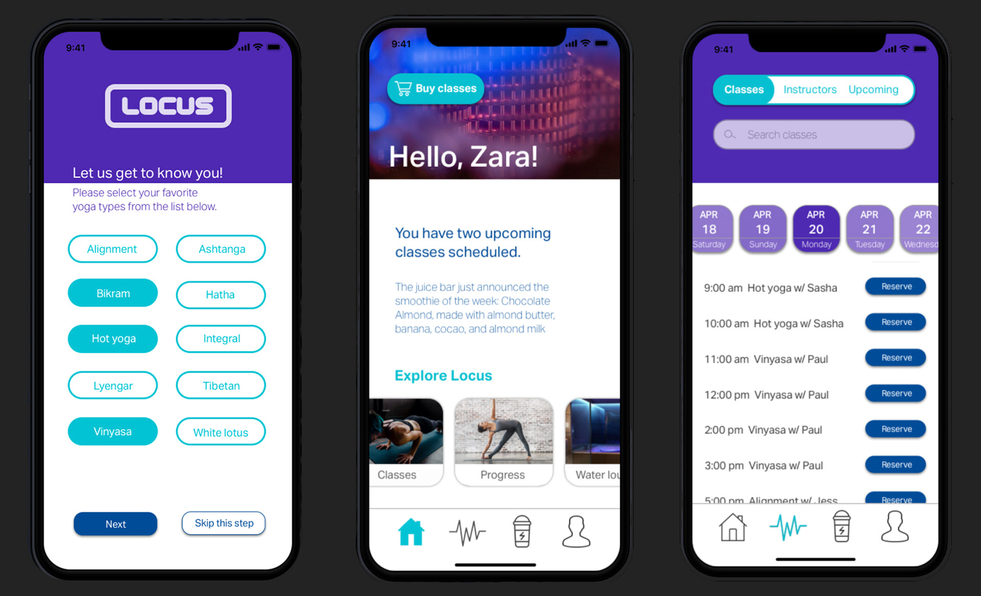
I wanted to highlight the spa’s amenities, so I included pages for the water lounge and juice bar. Members could get descriptions of the amenities, view the menu, and see any upcoming deals. I also created an account page for users to purchase classes and update their yoga preferences for future class and workshop recommendations.
08 Prototype
I compiled all my high fidelity screens into one clickable prototype to give users a sense of how it would function as a live app. It shows how users are able to complete all functions offered in the app, including completing the onboarding process, browsing classes and instructors, tracking their fitness progress, adding classes to their schedule, and viewing the juice bar menu.
Click image above to view prototype
09 Prototype Test
After creating a first draft of the prototype, I wanted to get a sense of the usability of the app through user interviews/testing. I recruited two participants to interact with the app prototype while being observed (one in person, and one remote). I created a test plan along with a script for each session that included several tasks to complete, as well as set of questions before, during, and after the test. The qualitative and quantitative data gathered during the usability test allowed me to discover areas that may need improvement within the app in its current state, which I iterated on for my final prototype.
My interviews revealed a number of key insights:
•both users completed their tasks relatively smoothly
•both participants liked the overall look and feel of the app
•the juice bar menu needed to be completely reformatted for better flow and legibility
Click image above to view prototype
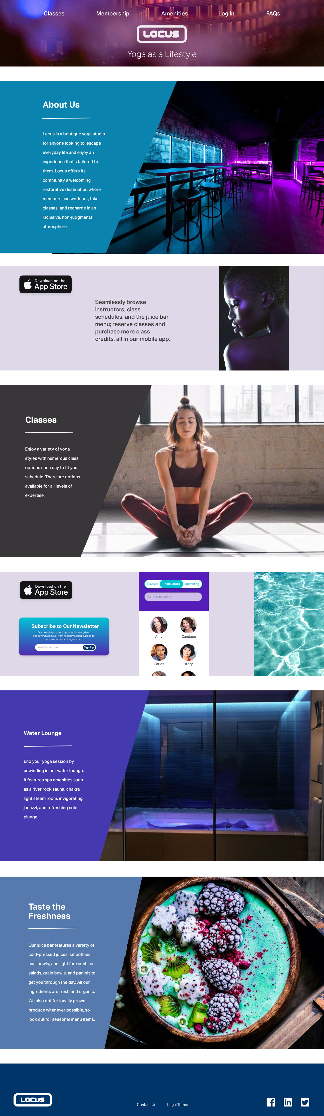
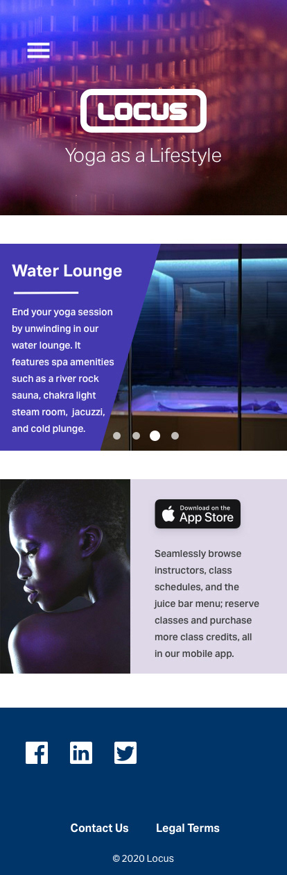
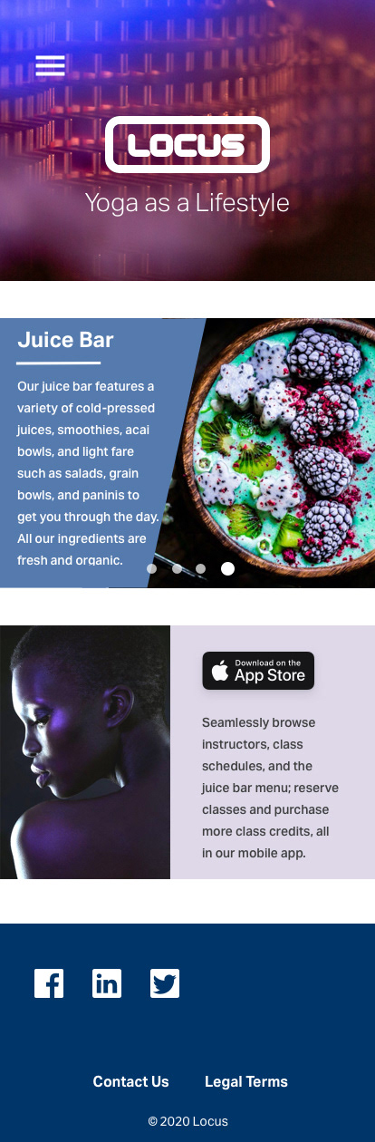
10 Responsive Marketing Website
Once the final prototype of the app was complete, I designed key screens for a marketing website, laying out the features of the app and Locus as a brand. Pictured are the desktop (left) and mobile versions (below). While the website layout is different from that of the app, I used the same design elements (everything from colors to photography to typography) to tie in the user’s brand experience and have them associate this aesthetic with the brand. I also incorporated social media icons in the bottom navigation for users to engage further with the brand.
Click image above to view prototype
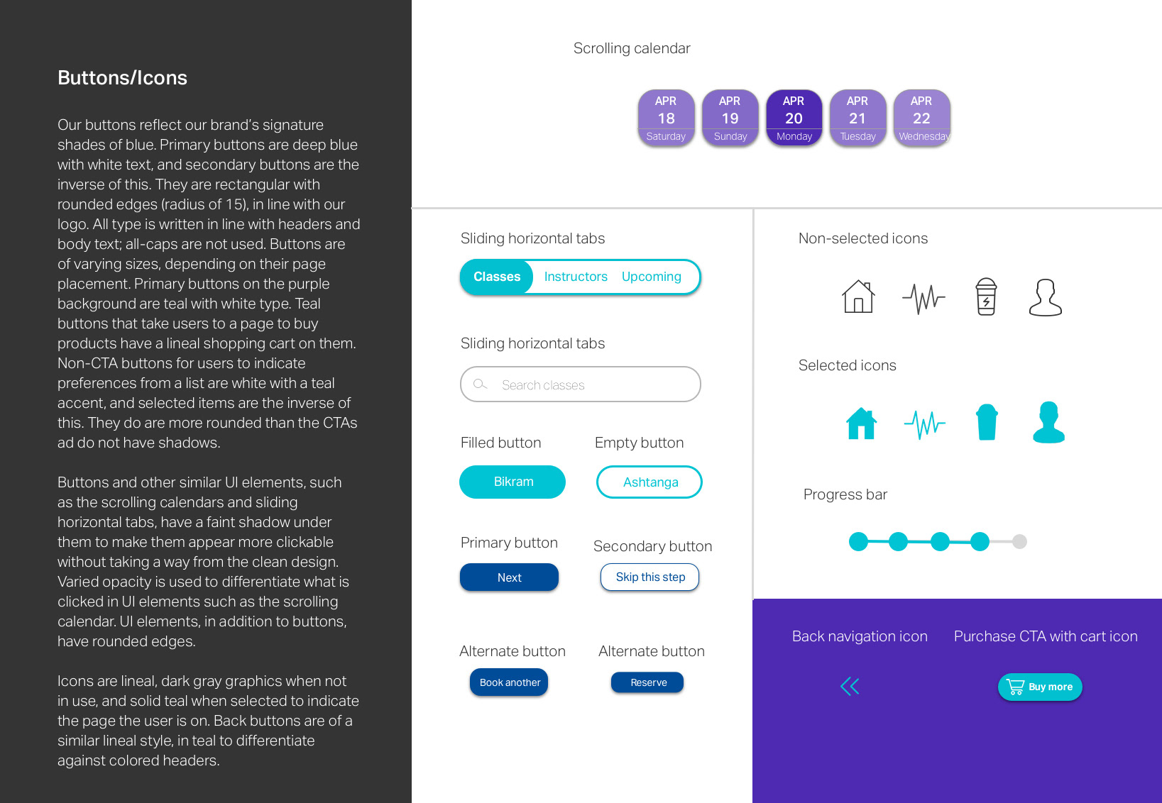
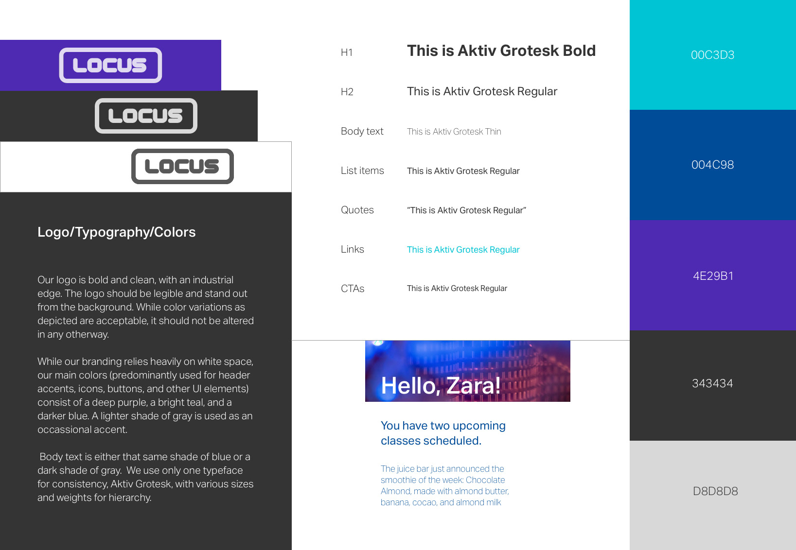
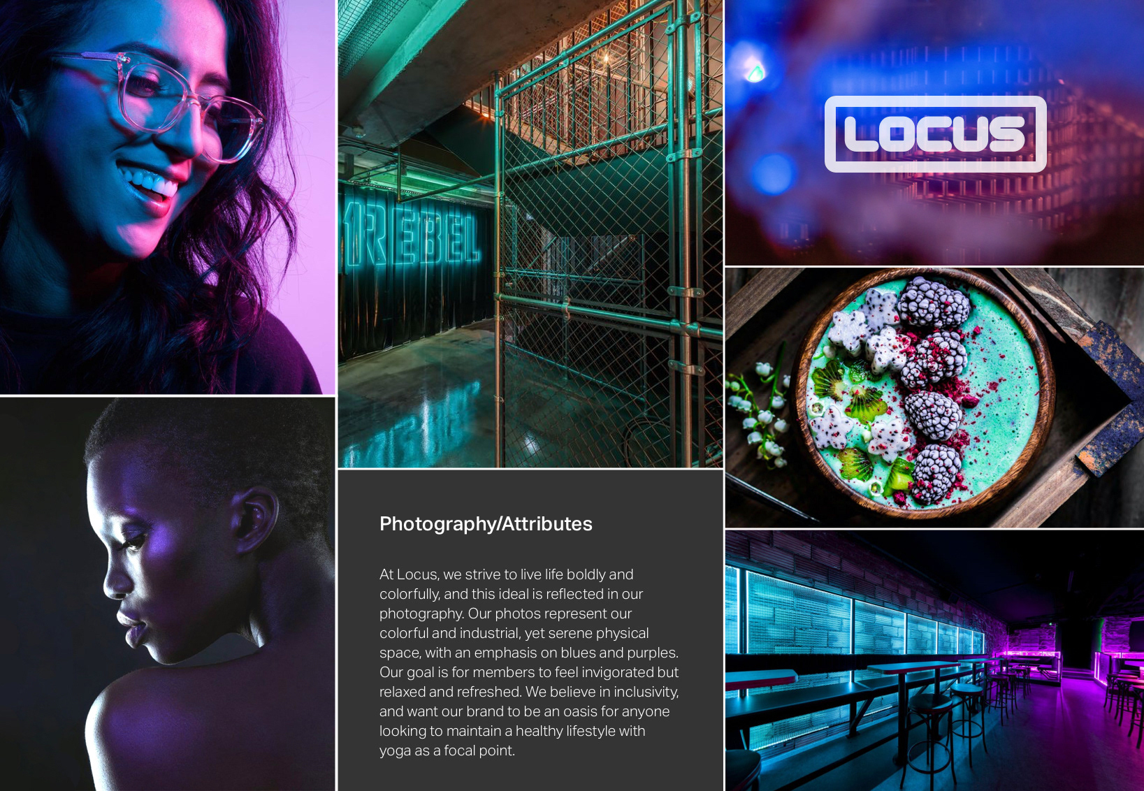
11 Style Guide
I created a style guide to provide insight into branding elements such as color, typography, photography, and layout. This page highlights the UI elements including CTAs, iconography, and search bars. The rounded aesthetic ties in to the logo, giving the user a sense of playfulness and approachability. Shadows under the CTAs make the buttons look more clickable. I also used a scrolling feature for both the calendar and the tabs for instructors and classes to give the app a more interactive feel.
This section of the style guide displays various uses of the logo, typeface, and color palette. I used only one typeface, which is clean and legible, in the app to keep the pages visually consistent. The simplicity of the text also allows the photography (below) to shine.
12 Outcome
Through several iterations of design following peer critiques, instructor feedback, and prototype tests, I improved the aesthetics and navigational flow of the app to better engage users and make their online yoga studio experience more seamless. Through this app, members of the Locus studio would have the opportunity to digitally engage with their community, and experience brand consistency beyond the physical space.