As a longterm freelance photographer, I appreciated the concept of this startup from the beginning. After an extensive photo shoot such as a wedding, I would come home to upload hundreds or even a couple thousand photos to my computer. From there, I would go through each photo to determine whether it was worth keeping or not. Many photos are easy to eliminate at a glance: blurry, over or underexposed, near-duplicates, strange facial expressions, etc. While this can be a quick process on small shoots, the time and energy can quickly add up on larger ones.
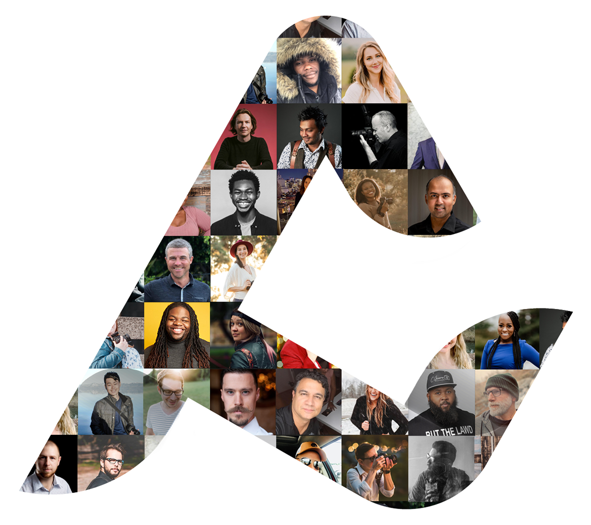
I took the shape of the AfterShoot logo and incorporated photos of some of its users in order to showcase the platform's diversity.
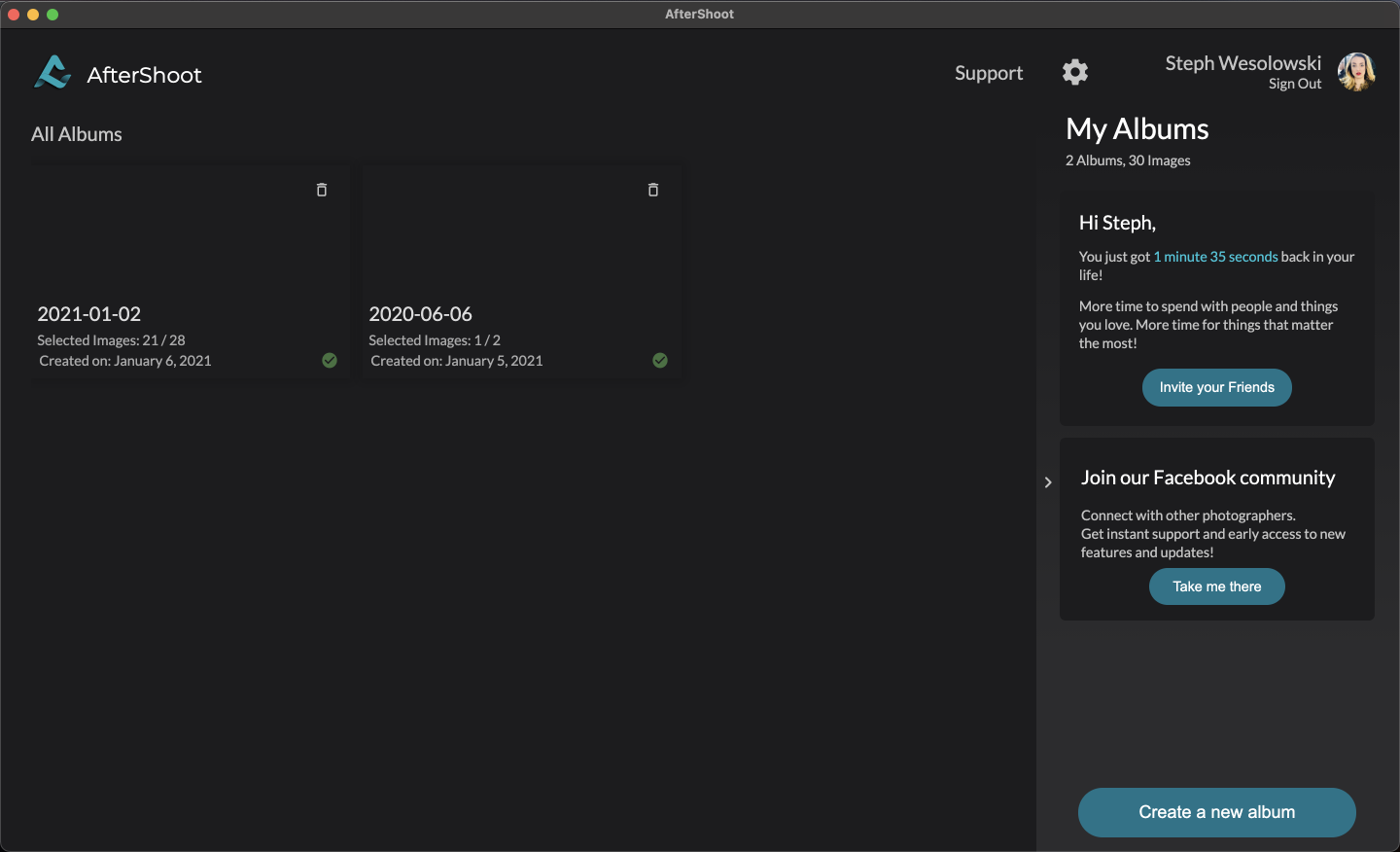
That's where AfterShoot comes in. This desktop application automates the culling process, quickly flagging problematic photos before import. I collaborated with the software developer to build out and refine both their desktop app and their website. There was a loose design system in place already, which I worked within to maintain consistent branding.
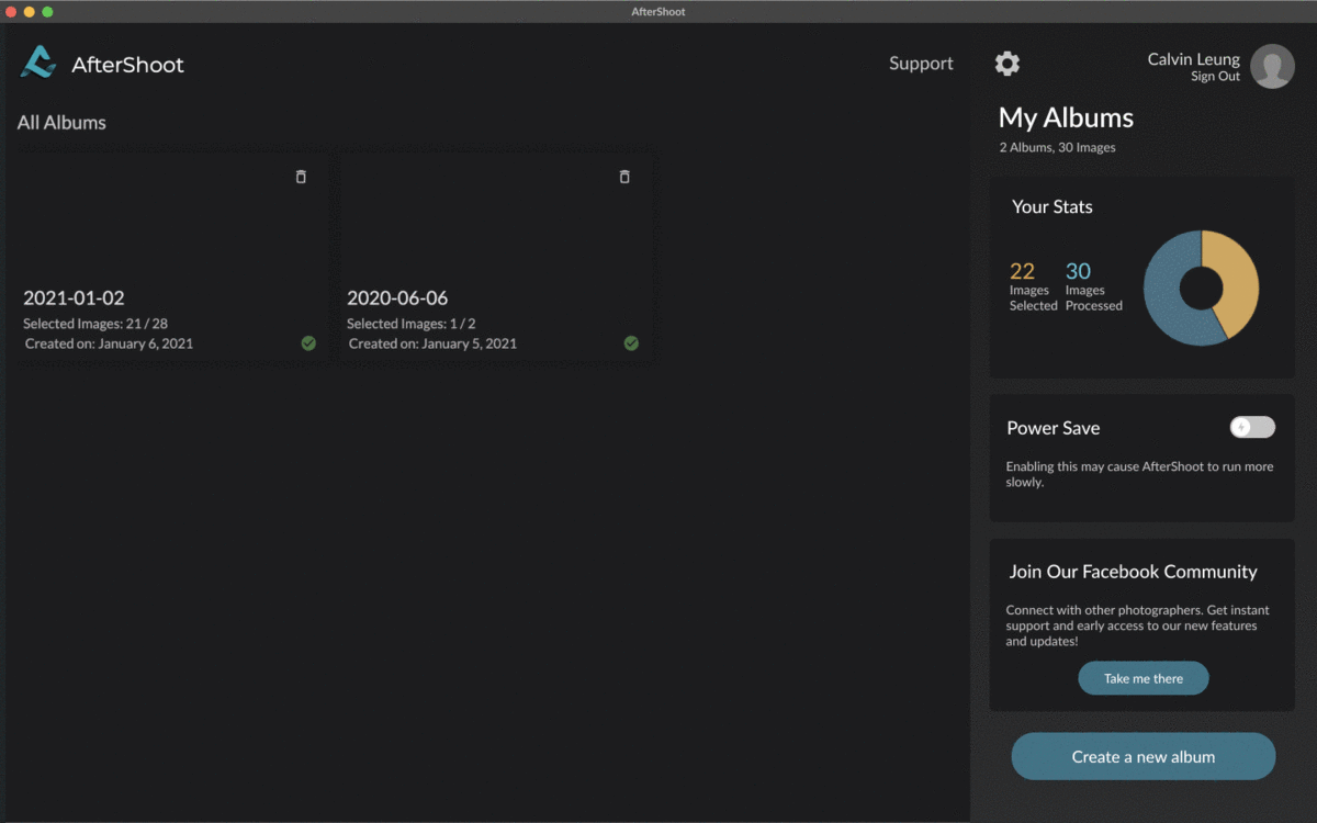
I collaborated with the software developer to create high-fidelity designs that he implemented on both the website and desktop. One visual feature I created (above) was a power save switch to allow the user to easily switch that mode on and off.
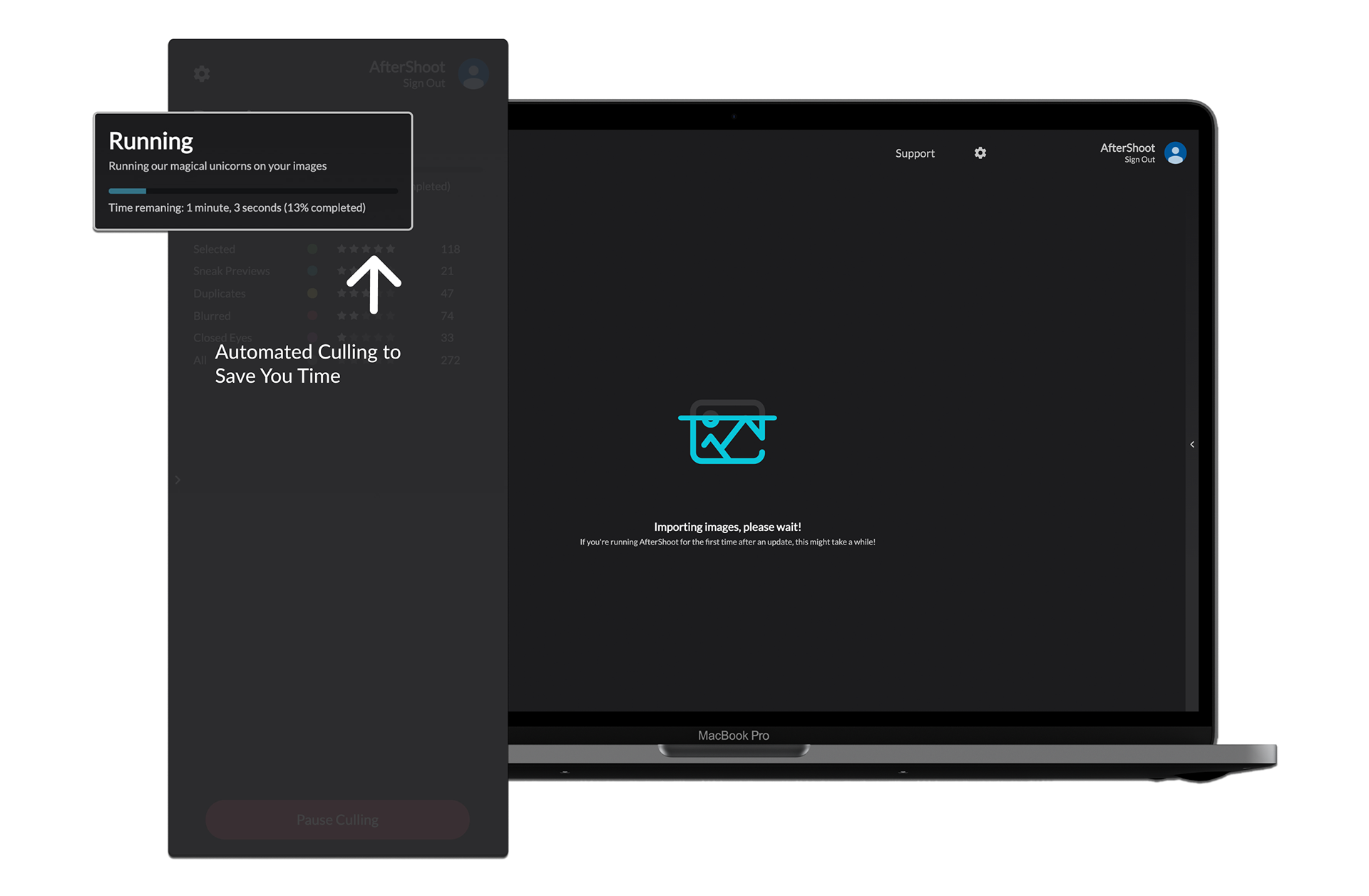
One of my tasks was to showcase primary app features on the company website. Above is a representation of how quickly the app goes through a set of images when automatically culling.
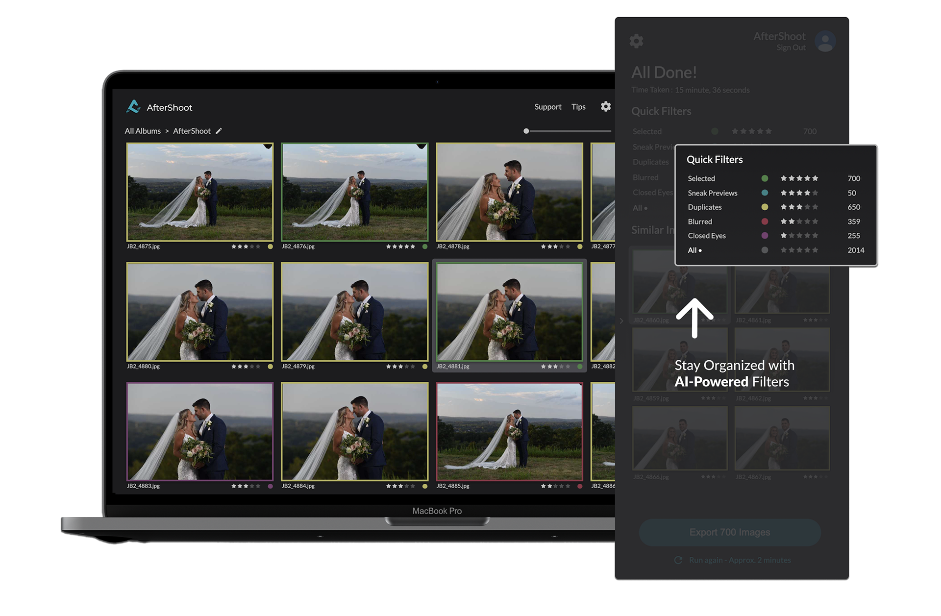
This design emphasizes the filters feature, where a user can easily sort through their photos by categories such as sneak previews or blurry images. These filters facilitate the process of deciding which photos should be eliminated, and which should be uploaded into the user's editing program of choice.
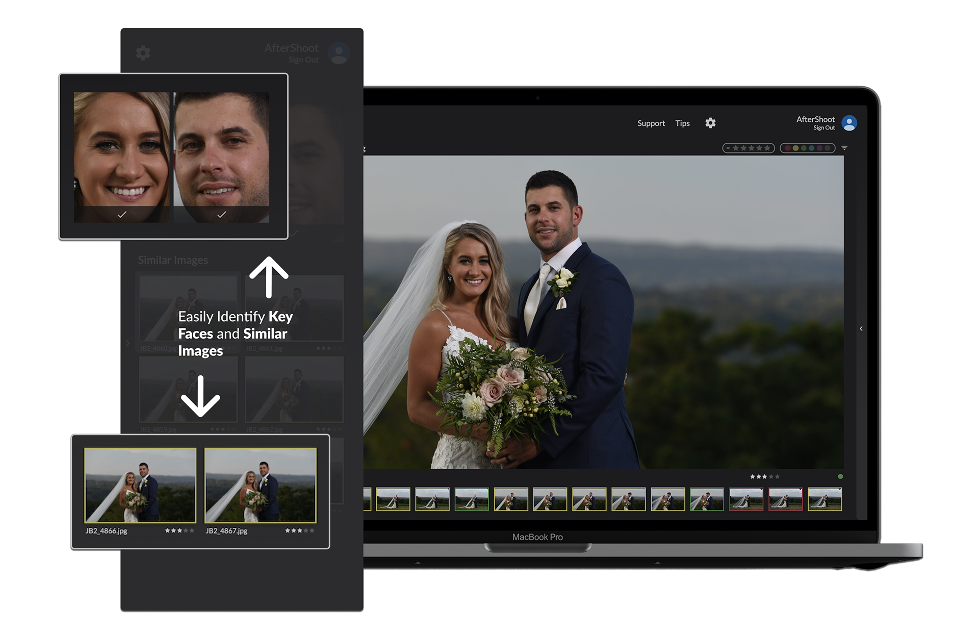
The third set of features I wanted to highlight was facial recognition and similar images. The user can sort photos by key faces, as well as compare similar images to select the best from each series.
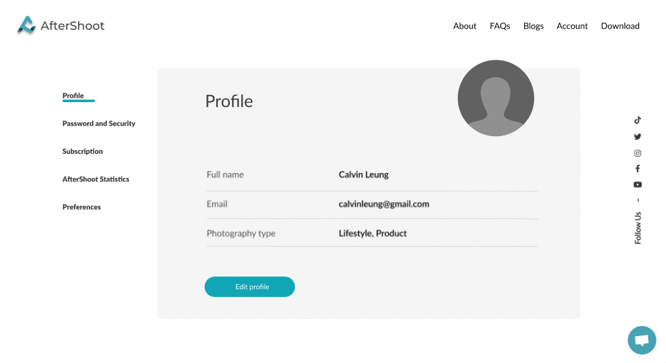
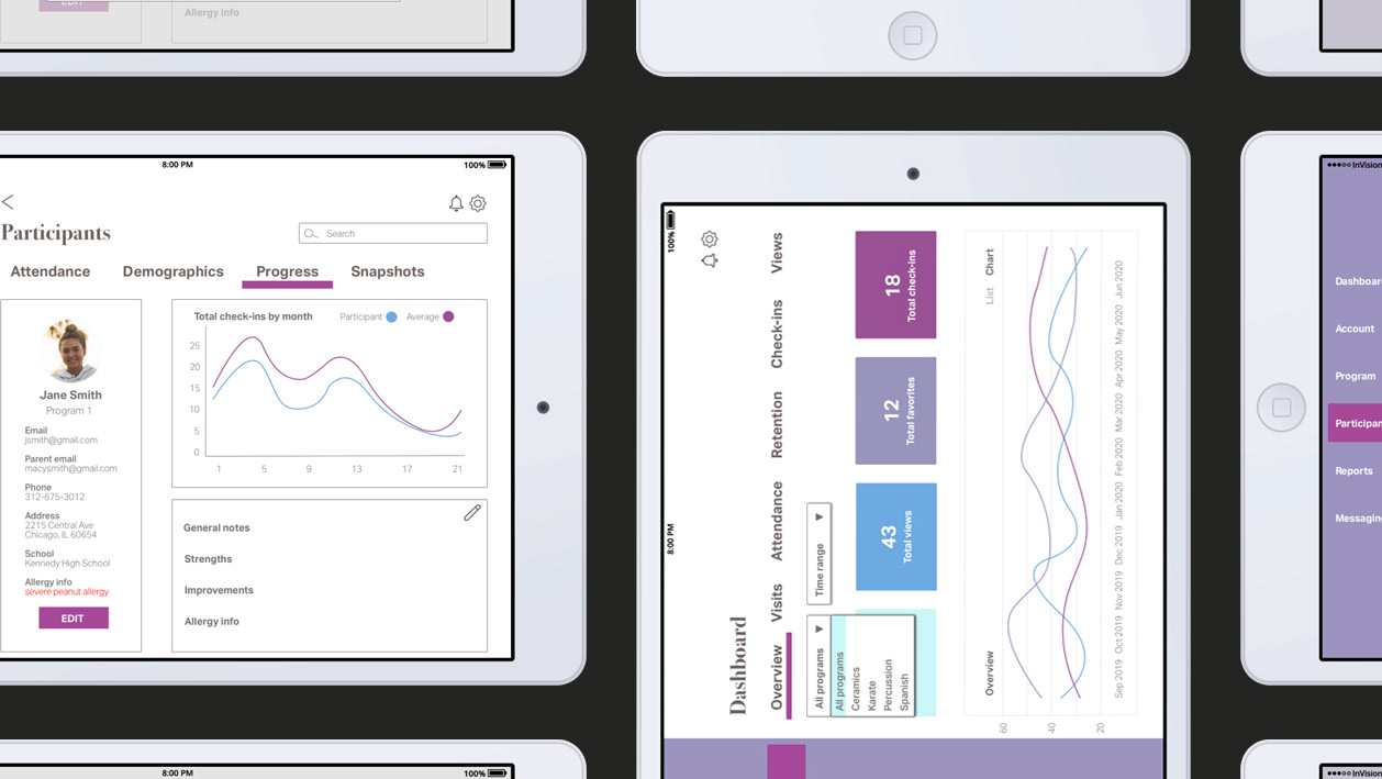
Some of the website's features had yet to be built out, including a profile page. As I designed new features, I made sure to keep my mockup's aesthetic consistent with that of the website: light, minimal, and easy to navigate. After several iterations, all of my mockups received positive feedback from the stakeholders. Most of them can be viewed live on the website, or on the desktop application, which can be downloaded from the website.