Client
Sustainable Sparkle Bar
Roles
UX/UI designer | Researcher | Project manager
Duration
Five weeks
Tools
Sketch | Invision | Zoom
01 Overview
Sparkle Bar is an LA-based brand that offers decorative body art, primarily biodegradable glitter, to customers attending events such as music festivals. Because the glitter is sustainable and eco-friendly, users are able to express their individuality without harming the environment, as standard glitter does.

The team: Anthony, Kat, Steph, Umair
Taylor, founder of Sparkle Bar. I knew her love of color had to be incorporated into the website.
02 The challenge
Sparkle Bar’s founder, Taylor McPherson, asked my team to refine her brand by redesigning the current website. Our goal was to improve the visual design and user experience as much as possible within the constraints (a somewhat limited time frame and no budget), the ultimate objective being increased online sales and booked events.
The current website is quite sparse and a bit difficult to navigate at times, so I knew I had to establish a more cohesive look by coming up with a color scheme and incorporating cohesive and professional photography (even just as placeholders). I would also have to create an intuitive user flow.
03 Competitive Analysis
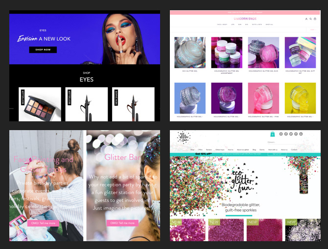
My team wanted to get a sense of this specific industry, so we conducted a competitive analysis. Through our research, we were able to put our project into context and understand the inner workings of the competitors’ (both direct and indirect) websites. By analyzing the websites of seven glitter and makeup brands, we were able to find out what works and what doesn’t. For example, I learned that light typeface on a high-contrast photo is nearly illegible. After gathering insights on what was actually successful however, I decided to incorporate the following into my final design:
• high quality professional images and bright swatches of bright accent colors
• pop-up providing discount codes to customers upon entering the website to hopefully increase sales
• highlight products as being sustainable/cruelty-free, which is appealing to more eco-conscious ixxxxxxxconsumers
04 Design Principles
Once we had a sense of which alternatives existed in the market, my team collectively came up with a set of design principles to establish branding, justify our design decisions, and maintain consistency throughout the platform.

Fun and Vibrant The website should be fun and vibrant in order to properly represent the brand and its products. The website should be colorful and visually appealing to keep users engaged.
Accessible Our goal is to consider people's entire experience as we develop the infrastructure, aesthetics, and features of the website. The platform should be simple, legible, and intuitive.
Consistent Consistent navigation and visuals can guide users to find essential information quickly and effectively.
05 User Interviews
We continued our quest for qualitative and quantitative data by interviewing relevant users to gather feedback on our progress to implement into our next design iterations. We did three sets of interviews throughout the design process, with four participants each. Once my team divided into pairs, I interviewed half the users, and was the notetaker for the other interviews. The majority of our participants had purchased glitter from the website in the past, so they had a better sense of the scope of the project, and were able to give us helpful insights into what was successful and what could be improved or added.


We asked the participants to complete various tasks (for example, adding an item to the cart) to test the seamlessness of our user flows. In addition, we asked them a number of questions throughout the interviews, such as:
• What does the color scheme make you think of?
• Was there anything that bothered you when xxxxxxxicompleting your tasks?
• On a scale of 1-10, how important is it that the xxxxxxxiproducts that you buy are eco-friendly?
After a couple participants canceled last minute, my team had to come up with our own users. This ended up being a good thing, as they represented the average user who had never before seen the current website. One key difference we noticed in the two types of users is that those who had purchased from Sparkle Bar wanted to see more photos of Taylor, while participants unfamiliar with the brand would rather the focus be on just the product.
06 User TESTING results
Our interviews revealed a number of key insights (some of which were supported by the competitive analysis), all of which I made sure were reflected in my final designs:
• Most users like pop-up screens that offer discounts
• Users want to see close-ups of the product, as well as how it looks on a model
• Users find having a search bar helpful to find specific products quickly
• Professional photography is essential
• Users appreciate a social media feed in addition to the usual social media icons
• Users prefer a modern look (fun but not too youthful) with easy navigation
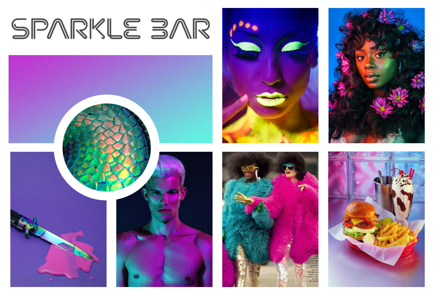
07 Mood Board
Each team member was responsible for coming up with individual designs. This started with creating three divergent mood boards to establish a visual direction before committing to specific elements. My goal with the chosen mood board was to enact an aesthetic that was relevant to a platform that sells glitter.
As such, my mood board consists of vibrant, fashion-centric photography with blue, purple, and pink overtones to create a sense of playfulness. While one of my divergent mood boards had a black background that was more visually striking, I stuck with a white background, as Taylor told us she found that white backgrounds resulted in higher sales.
08 Style Tile
I created this style tile as a further iteration on the mood board to include specific style elements such as typography, iconography, and a color palette. While some of these components evolved as I went into the next stage of my designs based on feedback (such as dropping the lime green and finding a more appropriate header font), the overall aesthetic remained the same: a clean layout with ample white space, as well as colorful accents and glittery photography.
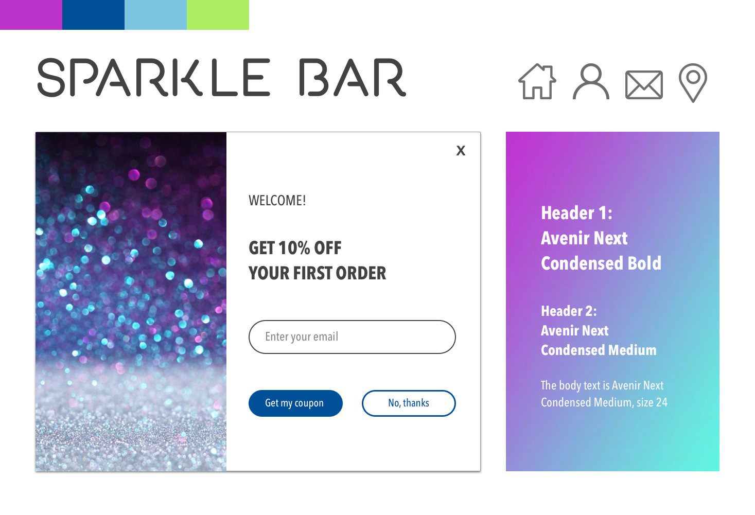
09 Style Guide
I created a style guide to provide insight into branding elements such as color, typography, photography, and layout.

Click image above to view full design system
10 High Fidelity Screens
The next stage of the design process was creating high fidelity screens based loosely on the current website, in the aesthetic of the above style tile. One of the first things to tackle was establishing an online shop. On the current website, all the products were found on one page, with little to no organization.
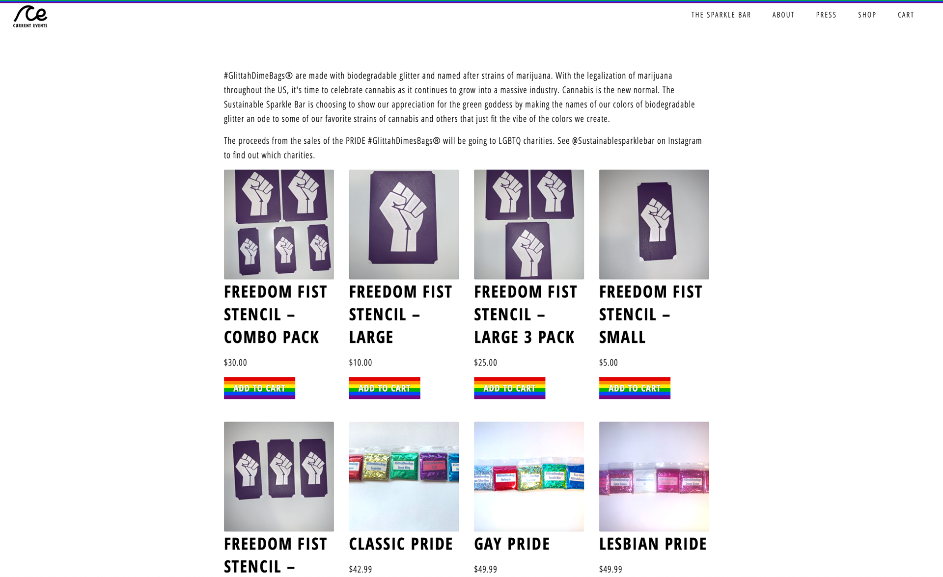
Original website
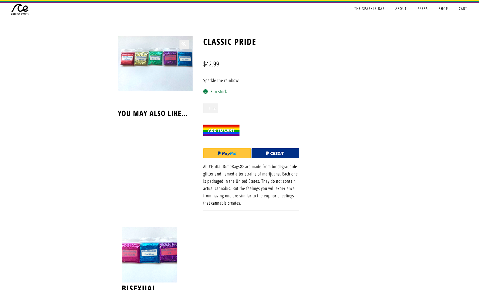
This was difficult to navigate, so I established several categories of products within the shop (below).
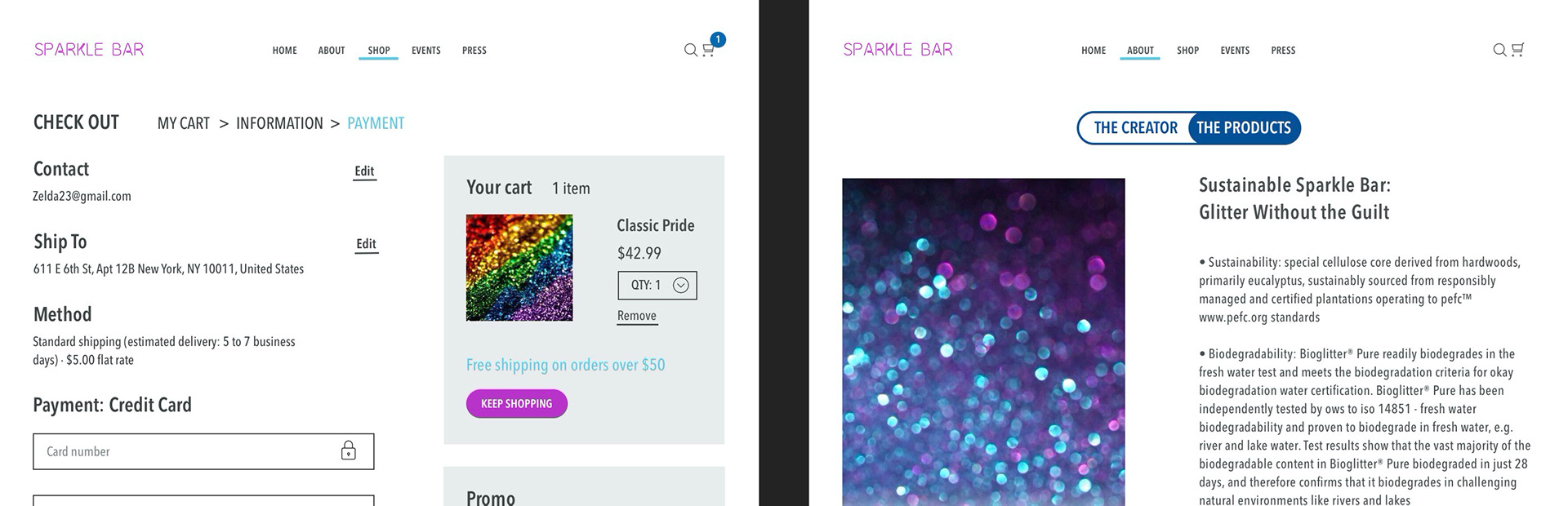
In the second iteration of high fidelity screens, I expanded on the shop and created a user flow to check out, from the cart to submitting the order. The cart can pop out of whichever screen the user is on, as opposed to taking them to a new page. I found that this was a common theme with our competitors and upon testing, users found the whole check-out process straightforward and easy to navigate.
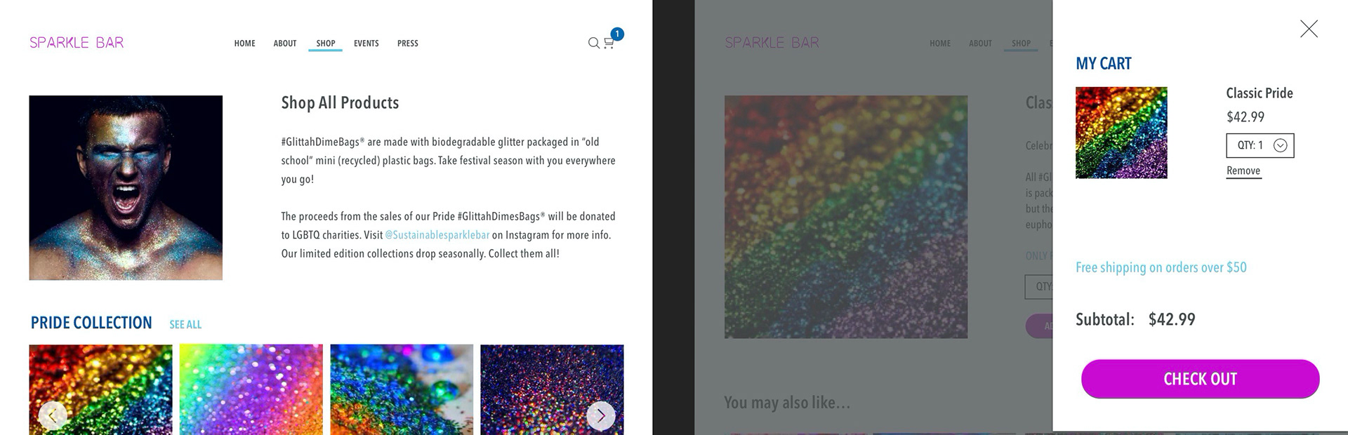
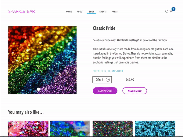
My high-fidelity screens
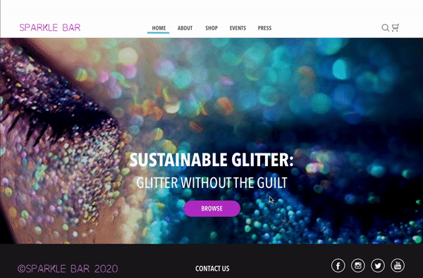
Another goal was to emphasize the eco-friendly nature of the product, as that’s one of the main things that distinguishes this brand from many of its competitors. I put a large header, “glitter without the guilt,” on the home page, and explained in depth how the glitter is biodegradable and sustainable in the “about” section. During critiques, I was told there was too much text on this page, so I broke the information into two tabs: one detailing the company’s creator, and one about the product itself.
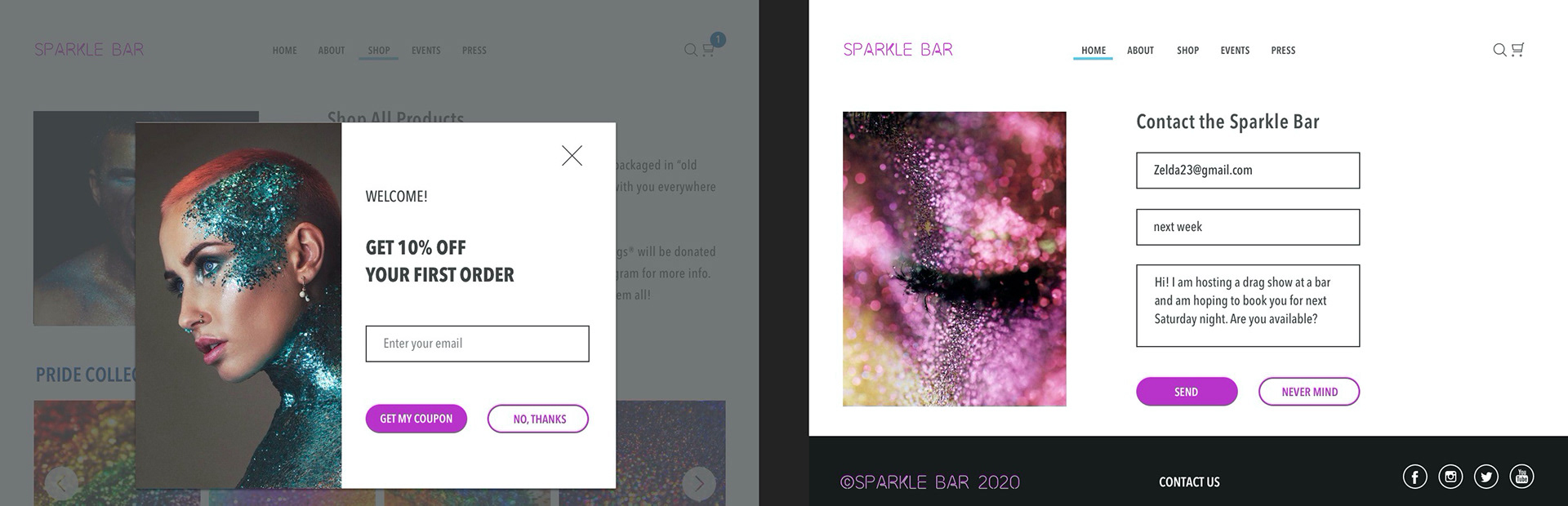
I incorporated additional features such as a discount pop-up, messaging page, and a search bar, also based on user interviews and client feedback. While I had social media icons in the bottom navigation from the beginning, a couple users mentioned wanting to see more of an emphasis on social media, so I added a scrolling Instagram feature.
11 Prototype
I compiled all my high fidelity screens into one clickable prototype to give users a sense of how it would function as a live website.
xxxxxxxClick image above to view prototype
12 Outcome
The last round of user testing was overall successful; the participants found the navigation to be smooth and intuitive. They also mentioned liking the colors and photography. During our last meeting, the client expressed excitement about the final product, and had no further suggestions for improvement. Through several iterations of design following each user interview, I had revamped the website structure and navigational flow to engage users, allowing their browsing and shopping experience to be more seamless.