Anyone who has had the misfortune of having to log into the New York Department of Labor's website to claim their unemployment benefits has my sympathy. Sure, it gets easier after a few tries. Nonetheless, there are entirely too many steps to accomplish something that should be straightforward. It's almost as if they intentionally designed the website to be difficult to navigate and consequently, deter already struggling people from claiming what they are entitled to. After my own frustration with this website mounted, I decided to redesign the log-in process to easily claim one's benefits.
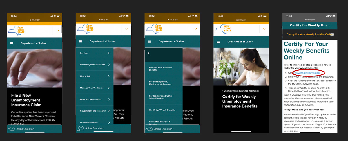
In order for unemployed New Yorkers to continue receiving benefits, they must "claim" them weekly through a questionnaire on the New York Department of Labor's website. Above are the screens the user must navigate through in order to get to a link where they can actually log in. If they type this final link directly into their browser, they will receive an error message. Because I found these five screens to be irrelevant, I omitted them entirely.
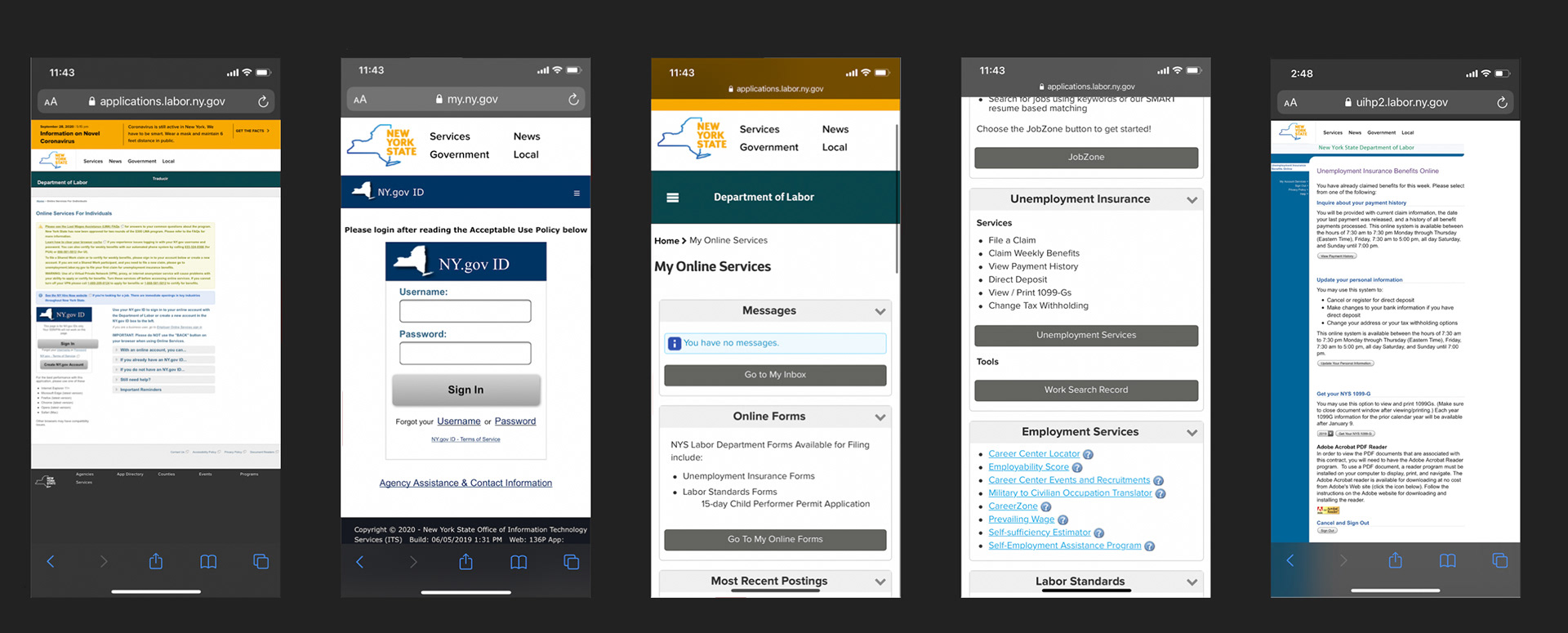
Once the user clicks the link, they are redirected to a log-in portal. I found this page to be confusing and filled with unhelpful text; the only item necessary for claiming benefits is the "sign in" CTA. Once this is clicked, users are directed to a log-in page. After logging it, they must scroll to "unemployment insurance." Underneath is a list containing "claim benefits." However, the user is unable to click on this directly; they must click on the "unemployment services" button, which leads them to another page where they can begin their questionnaire.
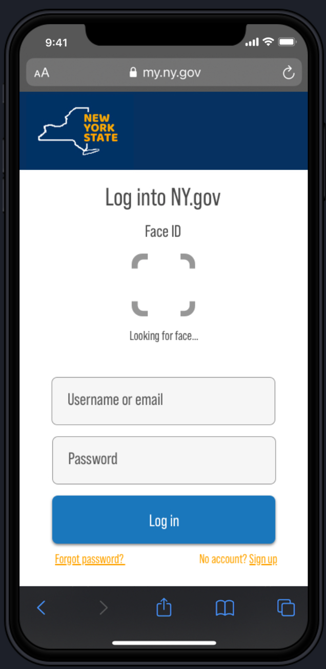
I recreated the log-in page to appear more clean and to the point. I added a couple features to make things more efficient for the user, including giving them the option of logging in with their email (as opposed to just their username), as well as a face ID feature to speed things up even more.
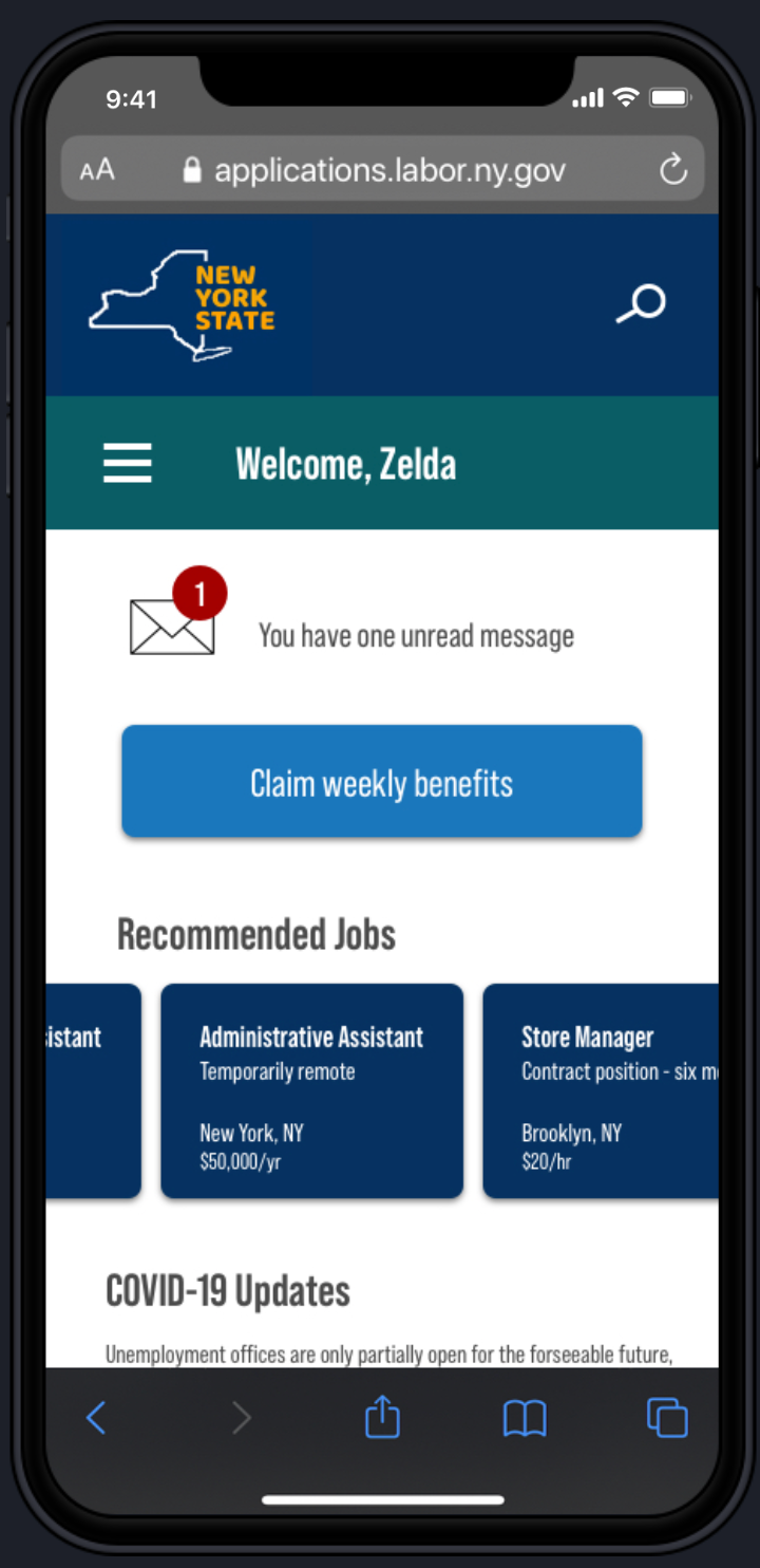
Because the Department of Labor website's content is too broad to create a cohesive experience for particular users, I narrowed down the portal to be tailored to unemployed people specifically. The landing page will welcome the user by name, and have relevant features for job hunters such as unread messages, recommended jobs, and COVID updates. I also added a search icon at the top. Most importantly is a large CTA that will bring users directly to the questionnaire where they can claim their benefits each week.
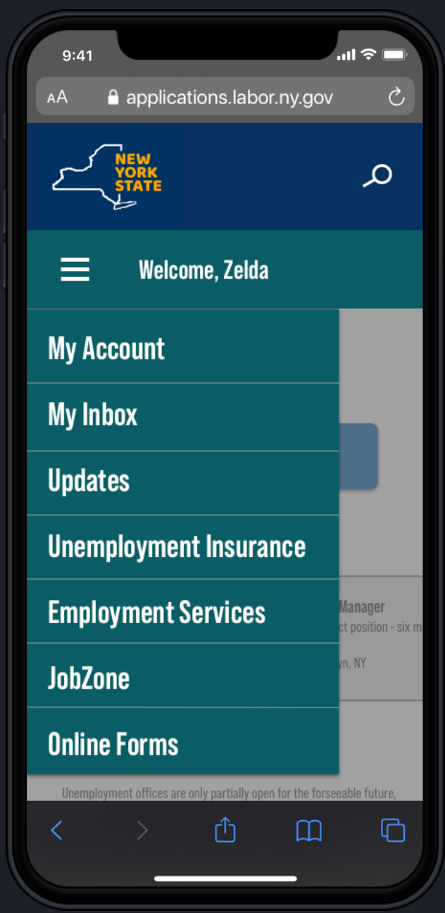
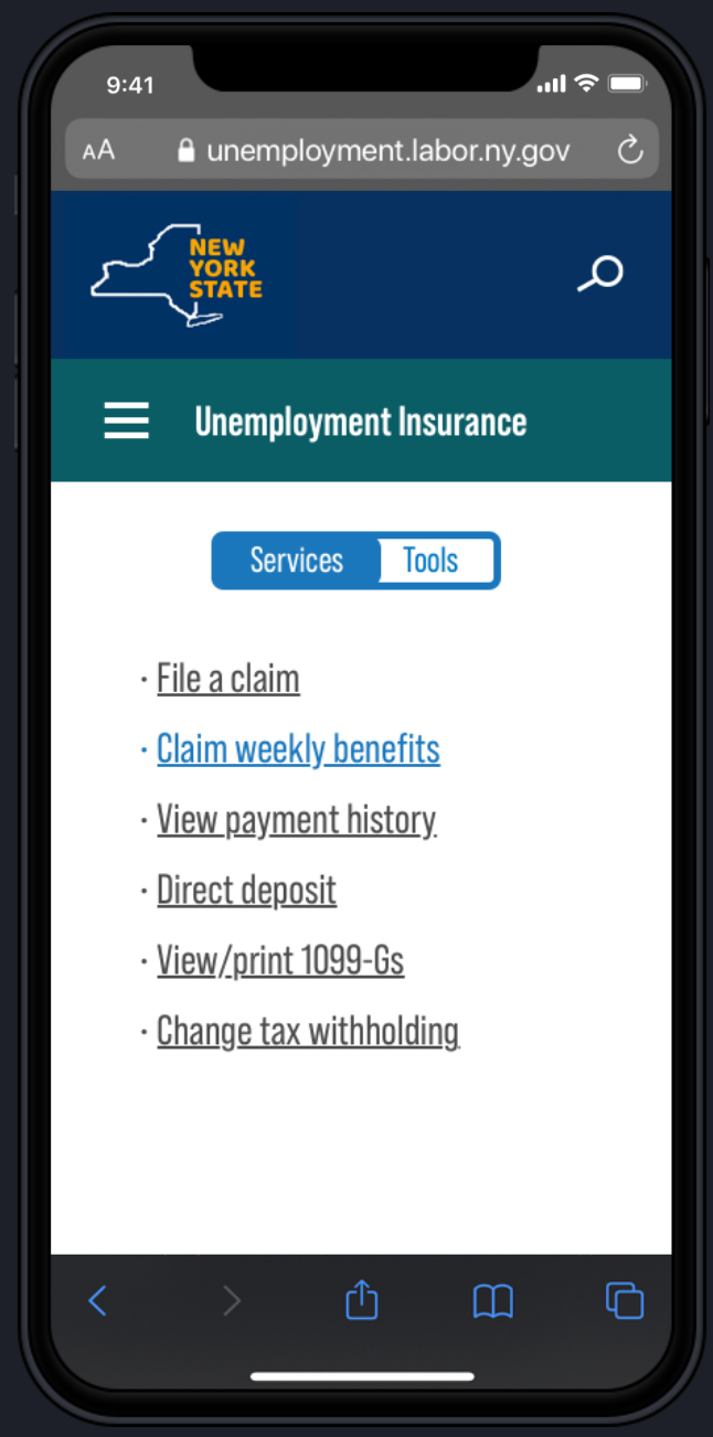
While the most frequently used/relevant features will be on the landing page, users will still have the option to access more features through a hamburger menu accessible from each page (see below). I modified the original menu slightly to be more cohesive, and condensed several overlapping categories. While there is a shortcut to access the "claim benefits" feature from the landing page, it can also be found fairly quickly within this menu.
With my redesign, the process of going from log-in to the benefits questionnaire has significantly fewer steps, and is far more intuitive. Users can easily access information that is relevant to them (future iterations of this project could include portals for other facets of the Department of Labor website). With the unemployment rate soaring, allowing people to claim their benefits seamlessly is more important now than ever. People searching for jobs in this economy have enough stress without being forced to continually navigate a terrible website.