Roles
UX/UI designer | Researcher | Project manager
Duration
Five weeks
Tools
Sketch | Invision | Zoom

The team: Anthony, Kat, Steph, Soobin
01 Overview
For this Flatiron School project, I created a platform called Recess geared towards after-school program managers. While it would be a multi-sided platform, we were to focus specifically on the administrative side.
Through this platform, program managers could digitally connect to students and maintain their records in a seamless and organized manner. Users should be able to interact with the after-school community conveniently through this platform. The goal was to ultimately build an active online community and incentivize continued funding.
02 The challenge
While my team and I worked collaboratively throughout the project, we were responsible for coming up with four individual designs. We were given a set of annotated wireframes to work from. Unfortunately, they were deeply flawed in terms of navigational flow. Many of the screens didn’t even connect to each other, and there were inconsistencies throughout.
So one of our main challenges was to decipher them and turn them into a smooth, easy-to-navigate platform. In order to pull this off, I would have to omit certain elements, rearrange others, and add pages onto the interface so everything could seamlessly connect. We decided to design for a tablet, as it would give program managers a more robust interface than a cell phone, while still allowing them more mobility than a desktop.
Samples of the wireframes we were given
03 Exploratory Research/Competitive Analysis
My team began by doing some exploratory research and conducting a competitive analysis to put the project into context. We researched general trends in the industry, its target audience, and how saturated the market is (as well as where there may be gaps). We generally found that while there were quite a few similar platforms, many lacked the seamlessness that we were striving for between program managers and students.
We also wanted to understand the inner workings of specific competitors’ (both direct and indirect) platforms. By analyzing the websites of seven educational/after-school brands, we were able to find out what works and what doesn’t. After seeing what was actually successful however, I decided to consider the following insights when implementing my own design:
•Bold colors are frequently used to engage viewers and help with navigation
•Information should be clearly laid out and not be cluttered
•Ties to the community are important (more so a future recommendation)
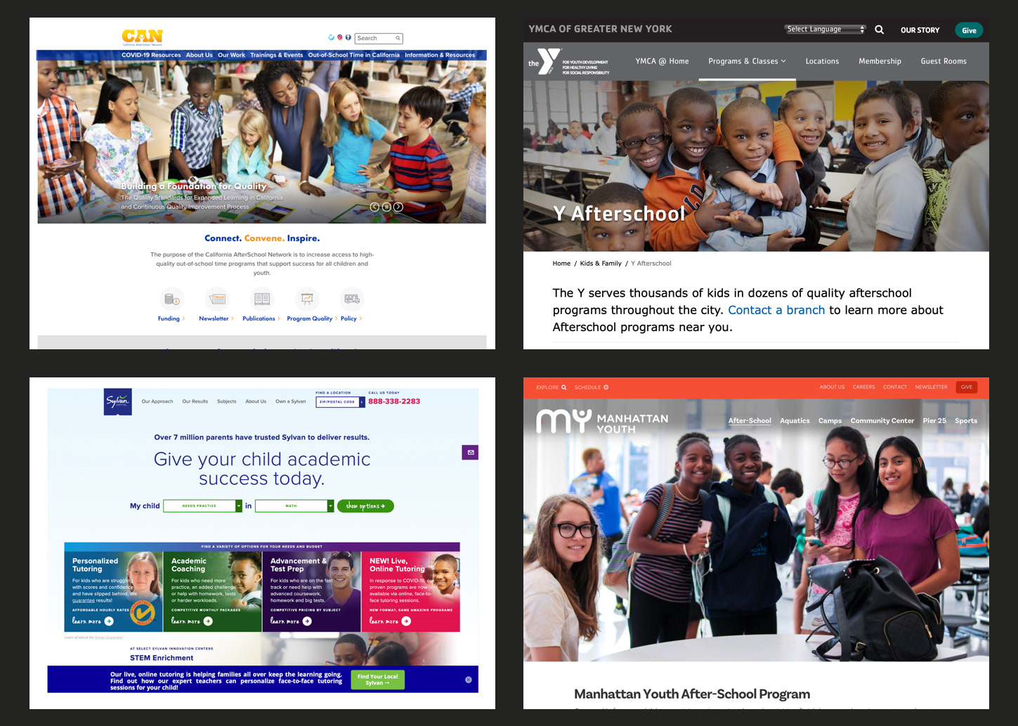
Screenshots from some competitors' websites: California Afterschool Network, YMCA, Sylvan, and Manhattan Youth
04 Design Principles
Once we had a sense of which alternatives existed in the market, my team collectively came up with a set of design principles to establish branding, justify our design decisions, and maintain consistency throughout the platform.
Universal Because we are designing for a broad range of users across the educational spectrum, we have to develop a universal platform. By empathizing with all users regardless of age, race, orientation, etc, our brand can be more welcoming and user-friendly. We must also maintain simplicity and intuitiveness to keep our platform accessible. Our goal is to continually consider people’s entire experience as we develop the infrastructure, aesthetics, and features.
Trustworthy We want to be a reliable and secure resource for our users, particularly because children are involved. Because our app will be handling a fair amount of privileged information, including financial and student records, we have to maintain a sense of reliability. It is imperative that records be kept secure and accurate. Through our design and infrastructure, we can instill a sense of trust with our users.
Connected Our platform should be a cohesive liaison amongst teachers, parents, and program managers/other educators. Communication between users will be a notable feature of the brand. Whether it is informing a teacher about a student allergy, or updating parents about a last-minute schedule change, this should be a platform for users to connect efficiently with one another.
05 User Interviews
My team continued our quest for qualitative and quantitative data by interviewing relevant users to gather feedback on our progress to implement into our next design iterations. We asked each participant a series of questions about our designs, as well as had them see if they could easily perform tasks in later stages, such as editing student notes.
We did three sets of interviews throughout the design process, with four participants each. Once my team divided into pairs, I interviewed half the users, and was the notetaker for the other interviews. The majority of our participants had a background in education and/or after-school programs, so they had a better sense of the scope of the project, and were able to let us know what was successful and what could be improved.

Our interviews revealed a number of key insights, which I made sure were reflected in my final designs:
• Most users wanted to see the use of color incorporated into the designs
• It is important to make the platform accessible to older users who may not be as tech-savvy
• Nearly all users favored simple designs over busy or cluttered ones
• Student allergy information is essential
06 Mood Board
I created three divergent mood boards to establish a visual direction before committing to specific design elements. Based on user testing, this one was the most successful overall. Users described the colors as calming, and they liked the use of white space.
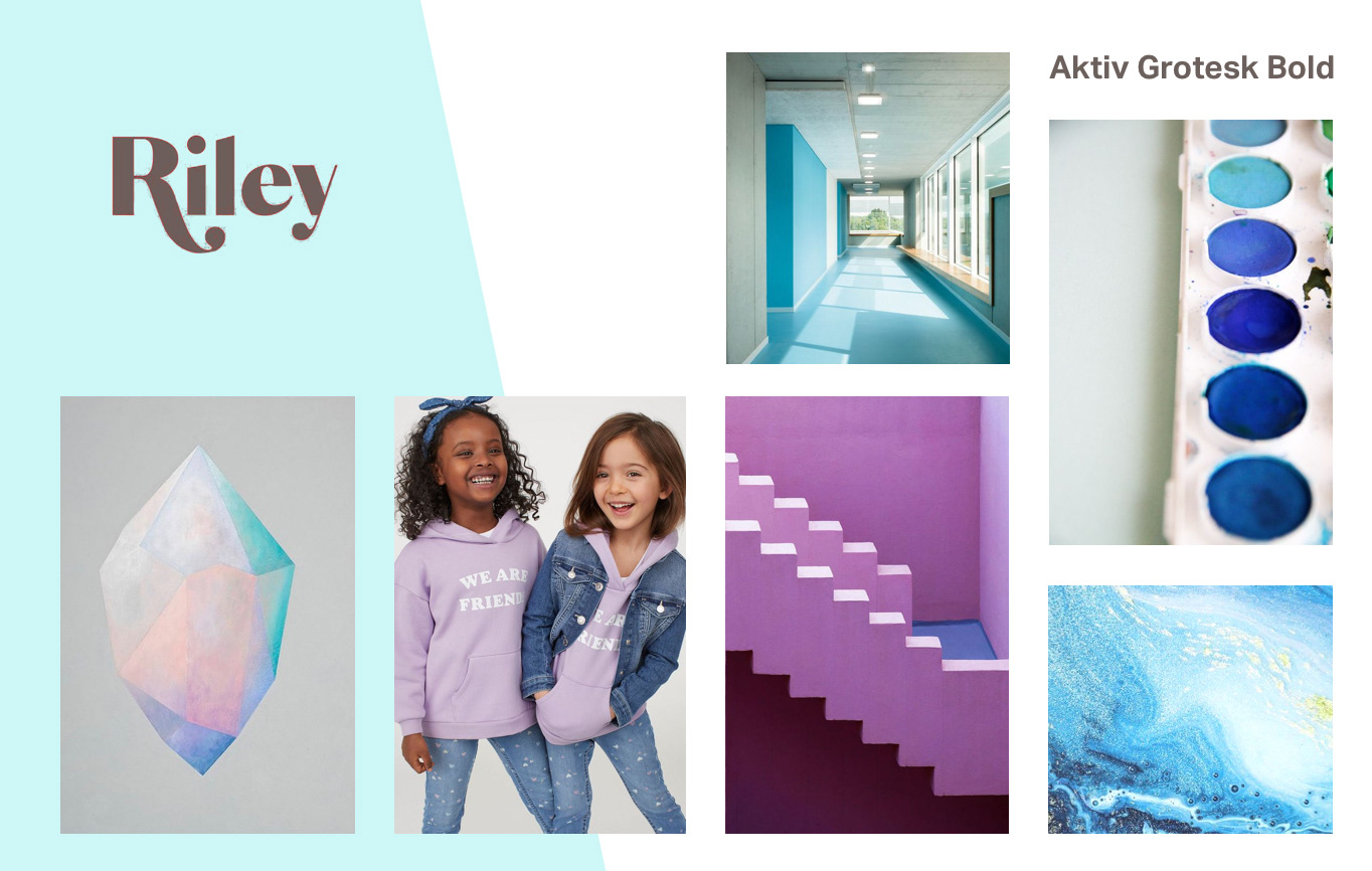
07 Style Tile
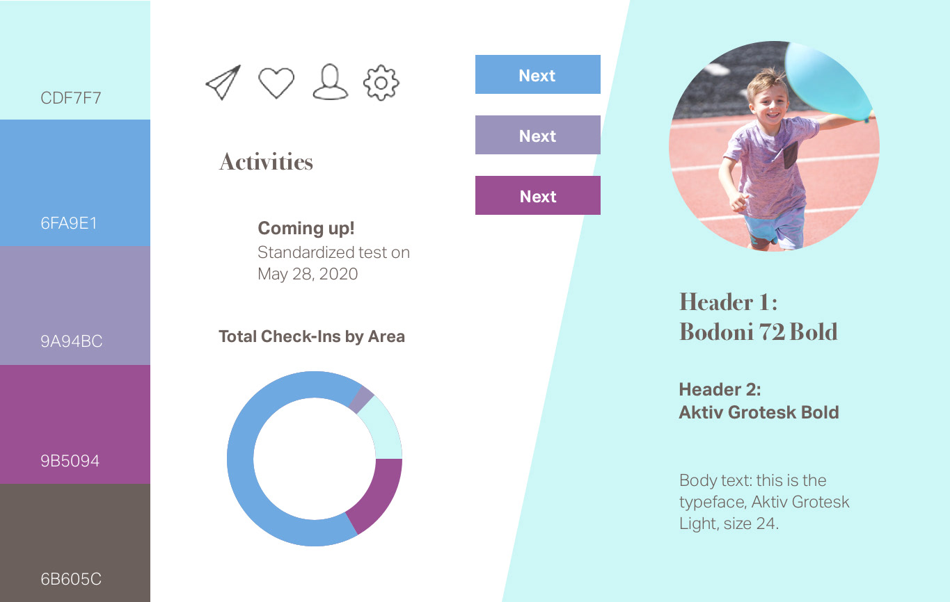
I created a style tile as a further iteration on the mood board to include specific style elements such as typography, iconography, logos, and a color palette.
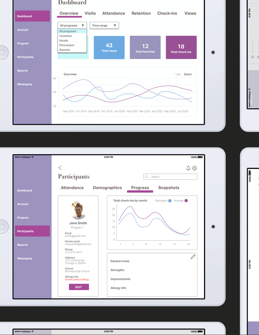
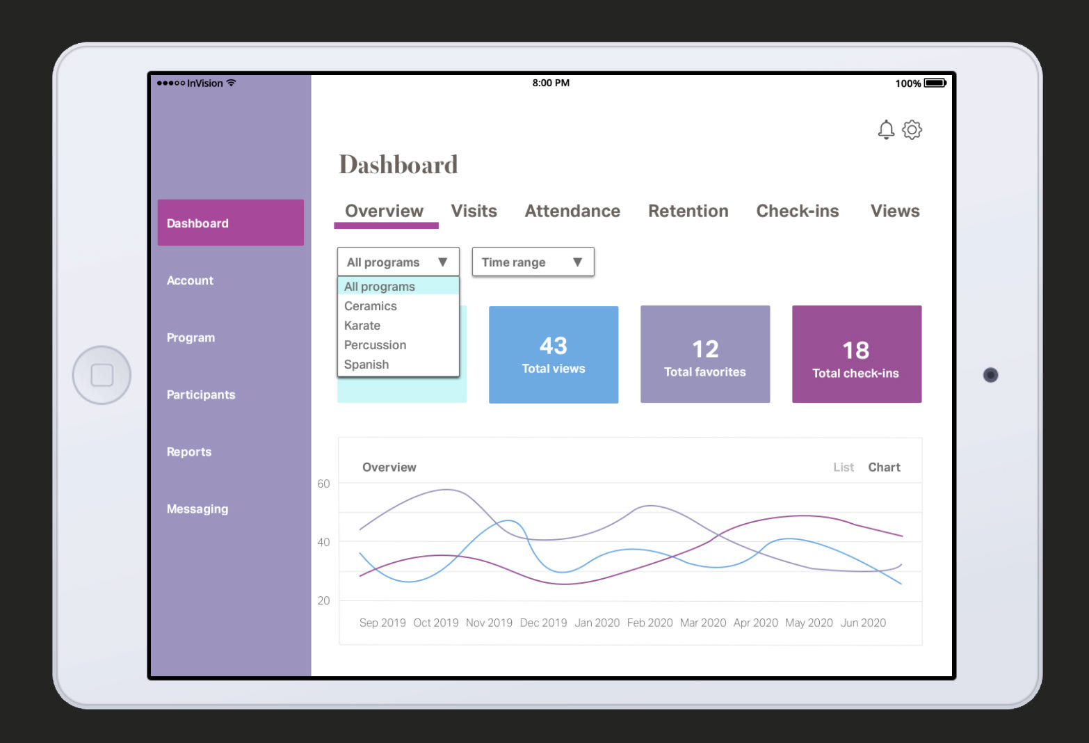
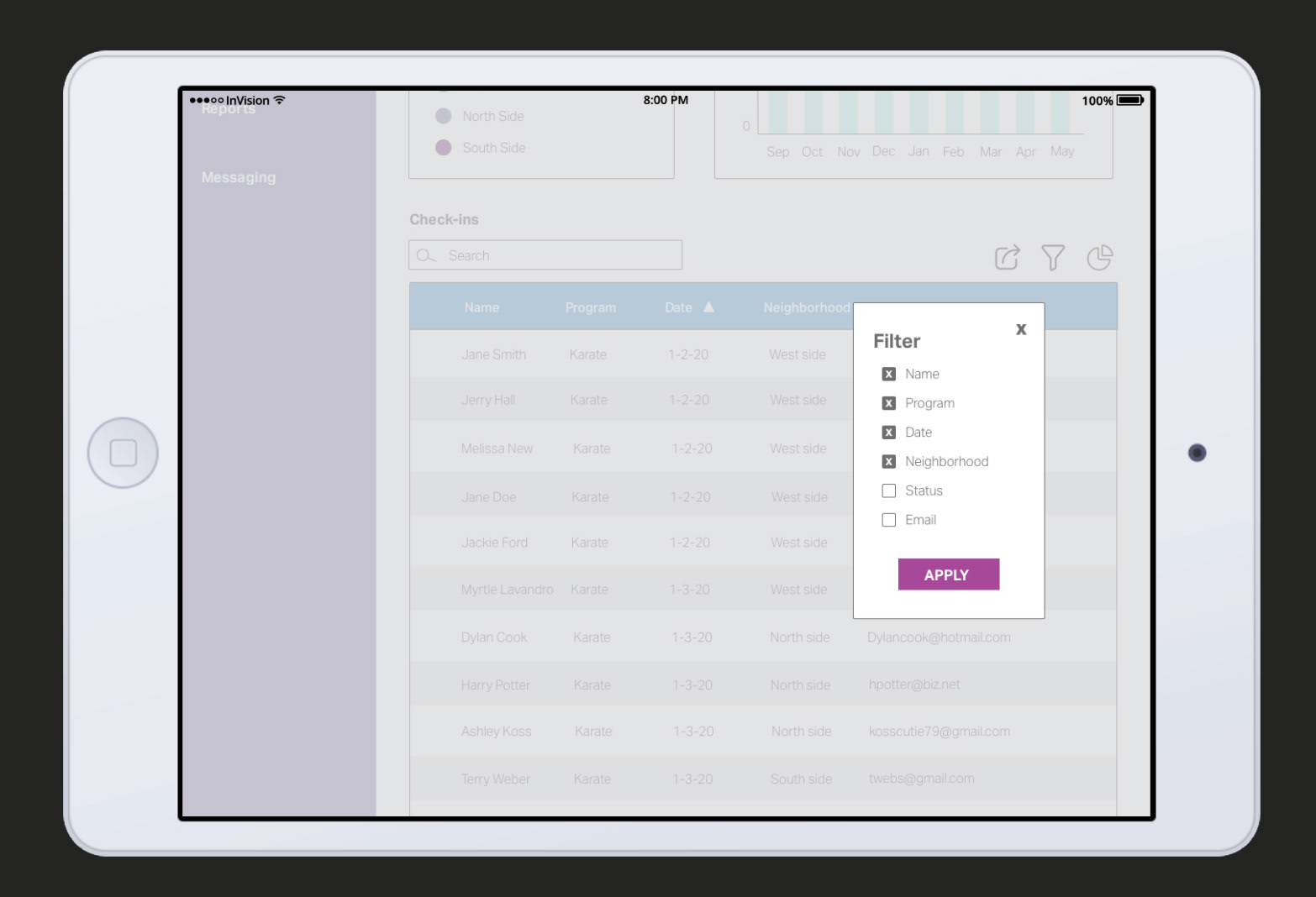
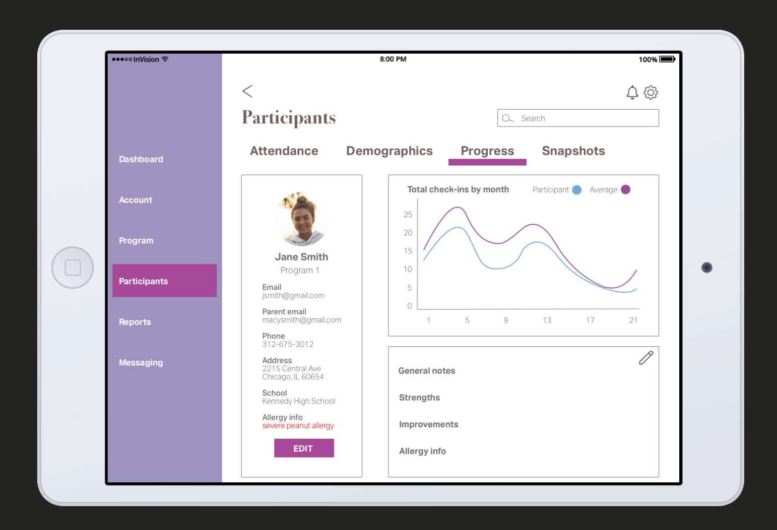
08 High Fidelity Screens
The next stage of the design process was creating high fidelity screens for an iPad, in the aesthetic of the above style tile. My goal throughout this process was to take the clumsy wireframes and make them more user-friendly.
One of the first things I focused on was the dashboard, where users can track statistics including the total number of students within each program, as well as their attendance. I showed various pages of the dashboard in different states, such as drop-downs for program names and time frames, and filters for viewing student lists.
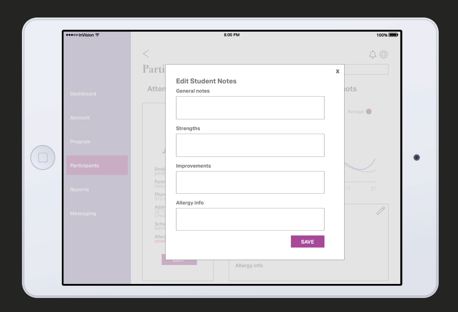
I also laid out a screen containing a student profile. Based on our user testing, allergy information is essential, so I included a section for that in red so it would be immediately visible. I also allowed the user to be able to edit notes about each student. Because we were designing for an iPad, I had a keyboard pop up as soon as the user clicked in the empty note cells. Participants during user testing were able to easily navigate through this task.
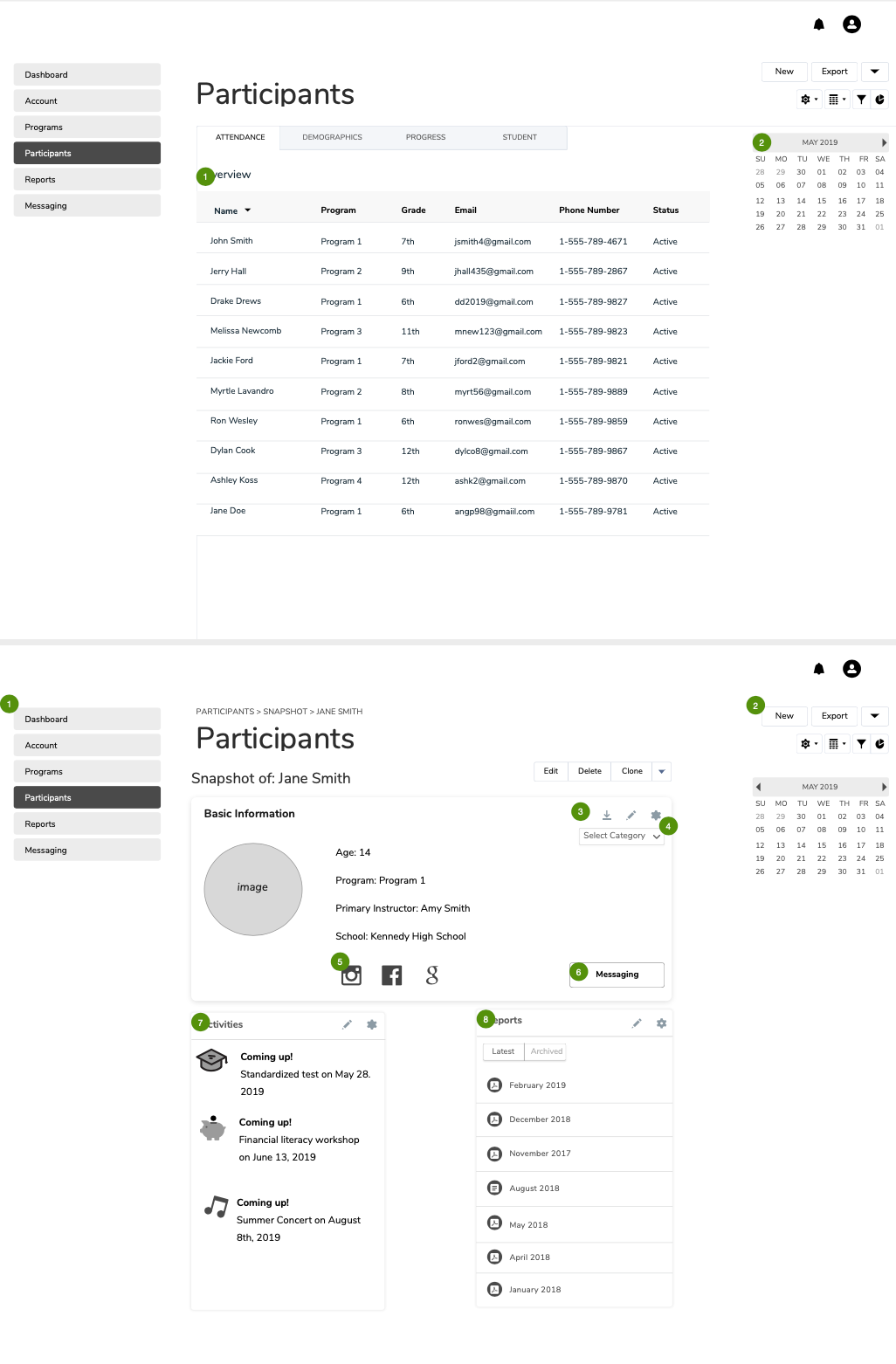
09 Prototype
I compiled all my high fidelity screens into one clickable prototype to give users a sense of how it would function as a live platform. It shows how users are able to complete all functions offered, including editing student notes, exporting documents, and tracking attendance.
xxxxxxxxxxxxxxxxxClick image above to view prototype
10 Style Guide
I created a style guide to provide insight into branding elements such as color, typography, photography, and layout.
Click image above to view style guide
11 Outcome
Through several iterations of design following peer critiques, instructor feedback, and user testing, I improved the aesthetics and navigational flow of the platform to better engage program managers and make their administrative tasks more seamless. Educators who participated in our user testing found my final prototype easy to navigate. They expressed interest in having it made available to them, as there is nothing in the market quite like it. Through this platform, Recess users would have the opportunity to digitally engage with their community, and have quick access to much-needed information, ultimately benefiting the students’ experience.